Create responsive layouts using Flex Grid
The first part of this tutorial introduced the basic features of the FlexGrid. This second part describes how to create a responsive layout from scratch.
The layout will have a three-column layout for the desktop view, two columns for tablets (768px) and one column for phones (480px).
Many websites are a variation of this type of layout, with content, sidebars, a header and a footer.
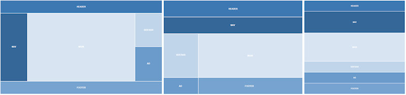
Desktop Layout
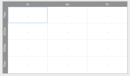
Open the properties of the flexgrid and set Columns to 3 and Rows to 4.
Open the properties of the flexgrid and set Columns to 3 and Rows to 4.
After setting the columns and rows, we can configure the grid areas (items). The quickest way to start a new layout is probably by clearing all existing items first. To do this select 'clear grid' in the 'Example' drop down menu. Note that the 'dots' indicate that the items are empty. Empty items cannot have any content.

To define a new grid item, select the cell where you want the item to start and give it a name. For example: 'header'
The header in this layout uses the entire first row, so set Column end to 3.
The header in this layout uses the entire first row, so set Column end to 3.

The navigation area starts in the first column and second row:
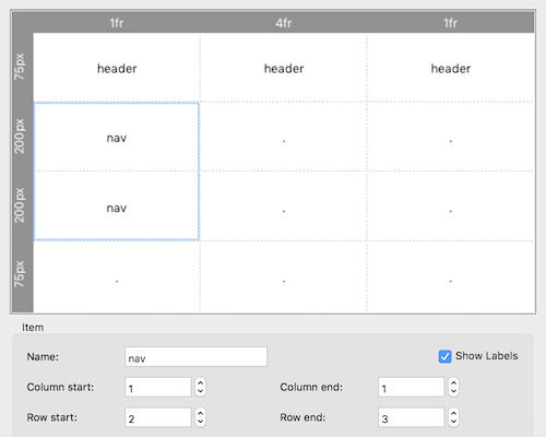
The other areas can be added the same way. Give them the following values:
content
Column start: 2
Column end: 2
Row start: 2
Row end: 3
Column start: 2
Column end: 2
Row start: 2
Row end: 3
sidebar
Column start: 3
Column end: 3
Row start: 2
Row end: 2
Column start: 3
Column end: 3
Row start: 2
Row end: 2
ad
Column start: 3
Column end: 3
Row start: 3
Row end: 3
Column start: 3
Column end: 3
Row start: 3
Row end: 3
footer
Column start: 1
Column end: 3
Row start: 4
Row end: 4
Column start: 1
Column end: 3
Row start: 4
Row end: 4
Setting column widths
Click the column headers to set the width of the columns to 1fr, 4fr and 1fr.
The layout now has two 1fr unit side columns and a middle column that has 4fr as the size. This means that the available space in the flexgrid is split into 6 and assigned in proportion to the 3 columns one part each to the side columns and 4 parts to the center.

Setting row heights
In this layout, the rows have fixed sizes: 75px, 200px, 200px and 75px.
You can also set the value to 'auto', in which case the height will be determined by the content inside the grid item.
In this layout, the rows have fixed sizes: 75px, 200px, 200px and 75px.
You can also set the value to 'auto', in which case the height will be determined by the content inside the grid item.
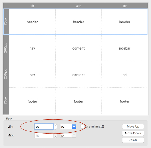
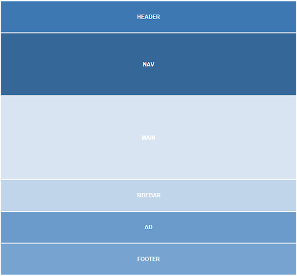
The layout will now look something like this:
Note: To make the individual areas more clear, the background color of each item has been set to a different shade of blue.
Note: To make the individual areas more clear, the background color of each item has been set to a different shade of blue.

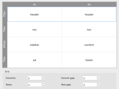
Tablet Layout
By adding a breakpoint, we can define a different layout for the same Flex Grid. Basically we can define a complete new layout, but of course we want to reuse the same objects from the desktop view so we should use the same names! All other properties can be different. For example, the layout can have a different number of rows/columns or the navigation can now be at the top instead of at the left side.
Step 1
Add a 768px breakpoint to the page.
Step 2
Open the Flex Grid properties and change the layout to this:
The Flex Grid will now look like this:

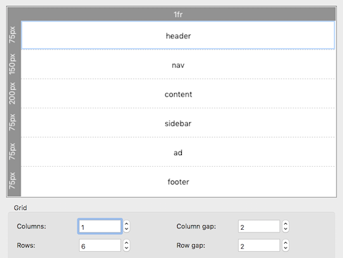
Mobile Layout
By adding another breakpoint, we can define a layout for even smaller screens. For example, for mobile phones.
In this case we stack all items on top of each other.
Step 1
Add a 480px breakpoint to the page.
Step 2
Open the Flex Grid properties and change the layout to this:
By adding another breakpoint, we can define a layout for even smaller screens. For example, for mobile phones.
In this case we stack all items on top of each other.
Step 1
Add a 480px breakpoint to the page.
Step 2
Open the Flex Grid properties and change the layout to this:
The Flex Grid will now look like this:
You can view a live demo here:
http://www.quickandeasywebbuilder.com/support/flexgrid
Download the demo project:
http://www.quickandeasywebbuilder.com/support/flexgrid/flexgrid.zip
http://www.quickandeasywebbuilder.com/support/flexgrid
Download the demo project:
http://www.quickandeasywebbuilder.com/support/flexgrid/flexgrid.zip
10 extra flexgrid layouts to help you get started:
http://www.quickandeasywebbuilder.com/support/flexgrid/flexgrid-layouts.zip
http://www.quickandeasywebbuilder.com/support/flexgrid/flexgrid-layouts.zip
