What is new in Quick ‘n Easy Web Builder 10?
It’s time for another major upgrade of Quick ‘n Easy Web Builder with lots of great new features and tools to create amazing website. Version 10 has more than 125 new features/improvements!
Here’s an overview of the most exciting new features. Besides screenshots there are also links to online examples and tutorials to demonstrate the new functionality.
Styles Everywhere
- New feature: Most built-in objects now have support for styles. This means that the colors and fonts of these objects can be controlled from one place (in the Style Manager). Styles can be useful to quickly update the style of the entire website during design time, but it's also possible to make a style switcher for when the page it online. Previously styles were only available for basic HTML elements like form elements (editbox, select, button etc.) layers, text. But in QWB10, also advanced elements like menus, login forms, jQuery UI / Bootstrap widgets, shapes and images have style support!
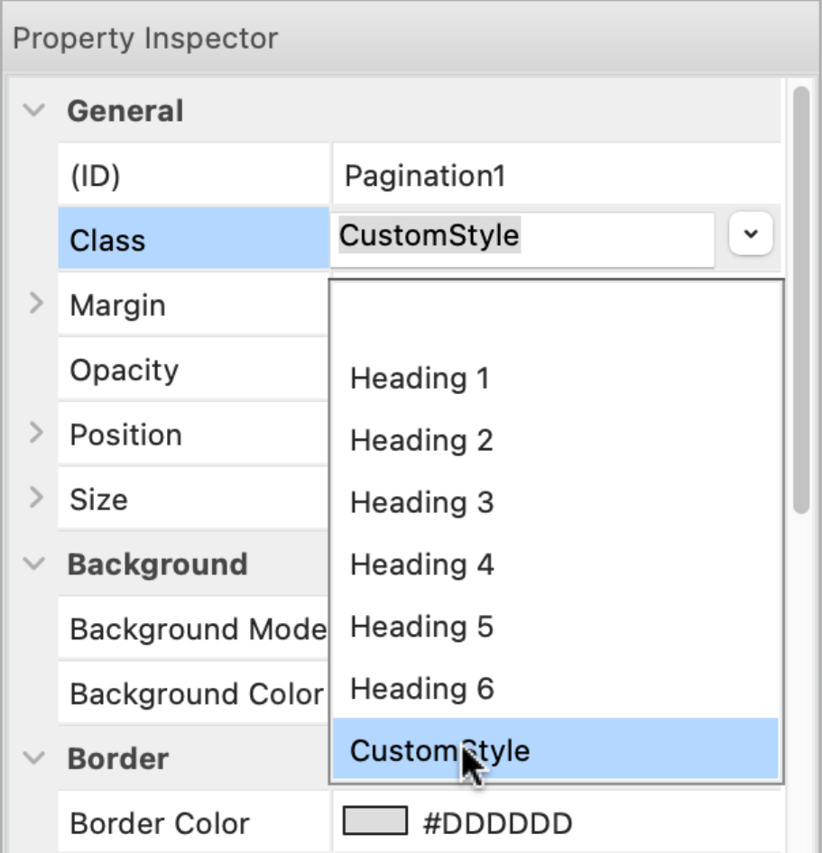
It's even possible to use styles for the page background.

Demo:
https://quickandeasywebbuilder.com/support/qwb10tryouts/qwb10_style_switcher.html
Examples:
https://quickandeasywebbuilder.com/support/qwb10tryouts/qwb10_styles_generic.html
https://quickandeasywebbuilder.com/support/qwb10tryouts/qwb10_styles_navigation.html
https://quickandeasywebbuilder.com/support/qwb10tryouts/qwb10_styles_widgets.html
https://quickandeasywebbuilder.com/support/qwb10tryouts/qwb10_styles_layout.html
https://quickandeasywebbuilder.com/support/qwb10tryouts/qwb10_styles_forms.html
https://quickandeasywebbuilder.com/support/qwb10tryouts/qwb10_styles_drawing_tools.html
Online tutorials:
https://quickandeasywebbuilder.com/style_manager.html
https://quickandeasywebbuilder.com/style_switcher.html
Dark Color Scheme
One of the reasons why QWB10 has extended support for styles is to make it possible to introduce another cool new feature: CSS color schemes (dark / light).
Now you can create a different color scheme for web site visitors who prefer dark mode. Normally, when you design a website it is for light mode only.
In the Style Manager, each color also has an (optional) dark color property, so you can set a different color for the background, text, border when the browser runs in dark mode.

There is a dedicated “Dark Color Scheme” button to switch between light and dark color scheme in the user interface.
Besides dark mode styles, QWB10 also has the possibility to invert the colors of an object for the dark color scheme. In that case, you do not have to use styles, but all colors will be inverted (negative). This property can be set for each object individually, because for some objects (like images) using inverted colors may not look good.

The option 'invert all objects' inverts all objects on the page (excluding images). Objects which are part of a layer/layout grid will not be inverted because the layer itself is already inverted. The option 'invert child elements' inverts all objects of the selected layer.
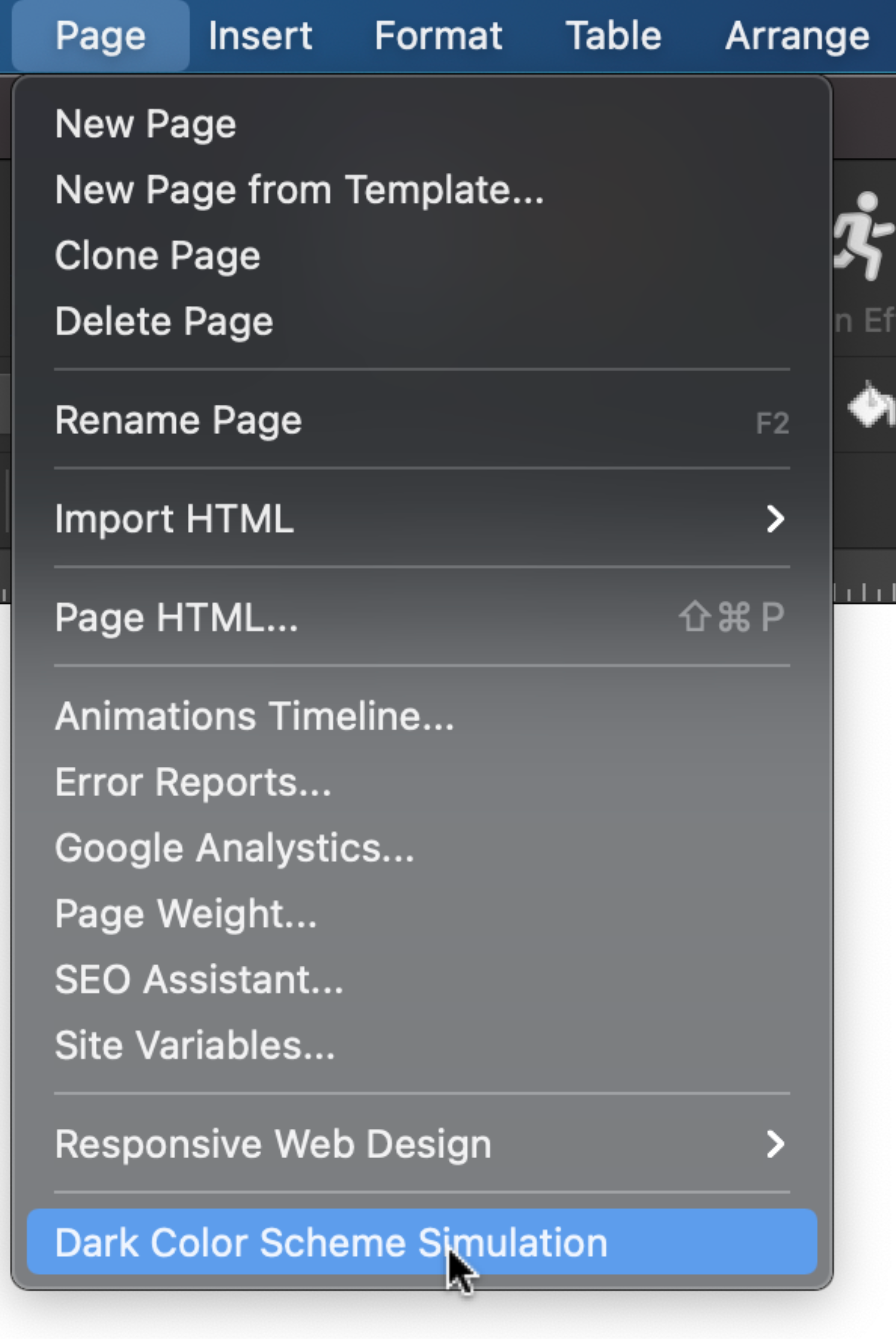
QWB10, supports 2 ways to activate the Dark Color Scheme:
- prefers-color-scheme, in this case the user preferences determined when the color scheme will be used.
- manual, in this case you can toggle the dark/light color scheme via events.
Demos:
https://quickandeasywebbuilder.com/support/qwb10tryouts/qwb10_darkmode_invert.html
https://quickandeasywebbuilder.com/support/qwb10tryouts/qwb10_darkmode_styles.html
Online tutorial:
https://quickandeasywebbuilder.com/darkcolorscheme.html
Mouse Effects
- New feature: Added 'Mouse Effects': Mouse Track and 3D tilt.
"Mouse Track" creates a sense of depth by making objects move in relation to the visitor’s mouse movement. The speed property controls the level of the effect.


"3d tilt' tilts the object according to the movement of the mouse. The angle sets the maximum tilt rotation (degrees).


The 'Direction" property can be used to reverse the track/tilt direction.
Mouse effects can be set for all objects via the 'Motion Effects' properties. These options are also available for individual card items!
Demos:
https://quickandeasywebbuilder.com/support/qwb10tryouts/qwb10_mousetrack.html
https://quickandeasywebbuilder.com/support/qwb10tryouts/qwb10_3dtilt.html
Online tutorial:
https://quickandeasywebbuilder.com/mouseeffects.html
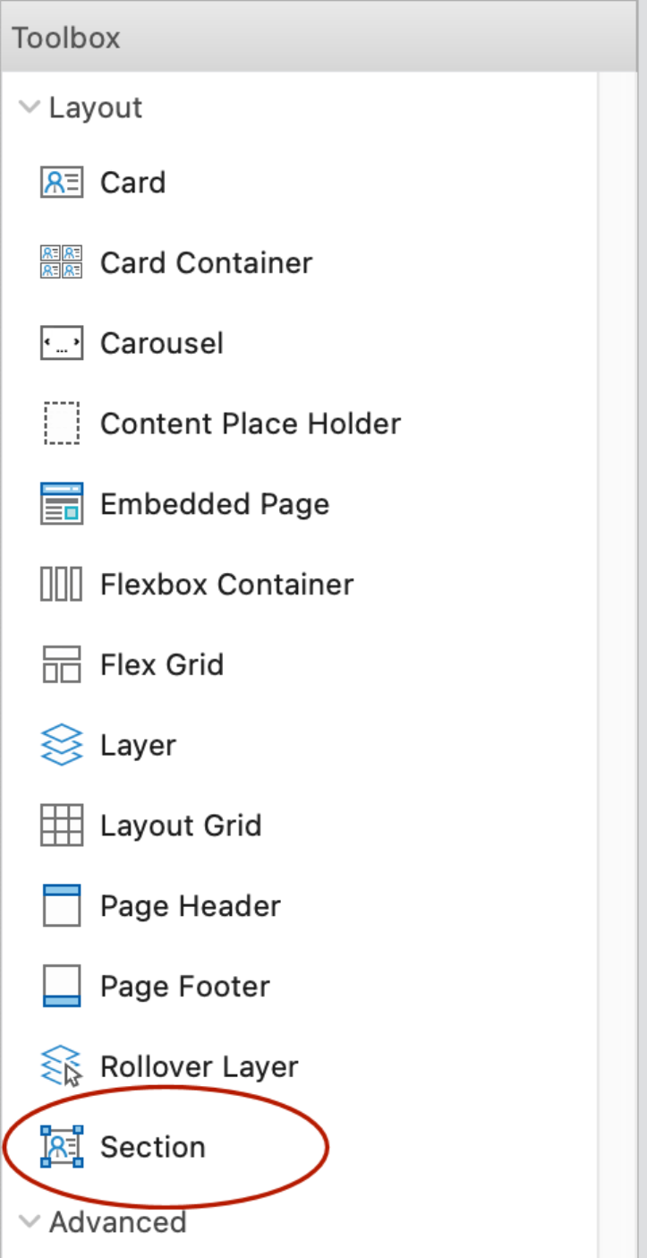
Section
- New feature: Many users love Cards, because they are easy to create great looking content blocks. QWB10 has a new design element called 'Section'.
A section is a responsive, self-contained layout container. Sections work the same as Cards, but the main difference is that items can be freely positioned (layered).
Self-contained means that all items in the section are embedded in the object itself, they are not separate elements (unlike layers and layout grids). This makes a section lightweight and adds lots of powerful options which normally would be very difficult to implement with individually elements.
Sections can be useful for cases where you want to overlap multiple elements (for example images) which normally would not be possible in flexible layouts. The alignment (horizontal/vertical) of an element can be left, center, right, stretched or scaled. Just like a card, Sections support dividers, synchronized transitions, animations, events and much more!


Here some layout examples with sections. All examples are scalable and responsive.


In additional to the items you know from Cards, Sections also support shapes.
Shapes are built-in SVG images that can be used to create unique backgrounds!

The following section implements a (scalable) ‘cosmos’ with absolute positioned planets. And … just for the fun of it, we’ve also added some mouse track effects to make the cosmos interactive😉 The planets move separately from each other.

Demos:
https://quickandeasywebbuilder.com/support/qwb10tryouts/qwb10_section.html
https://quickandeasywebbuilder.com/support/qwb10tryouts/qwb10_planets.html
Online tutorial:
https://quickandeasywebbuilder.com/section.html
Custom Scrollbars
- New feature: Added the ability to customize the scrollbars of web pages. Now you can style scrollbars to match the rest of your design! There are properties to set the colors, width, border and radius.

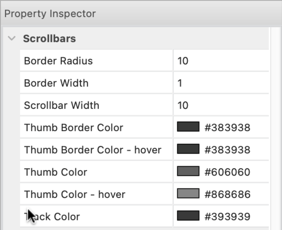
Note that this is an experimental feature because Custom Scrollbars are not fully supported by all browsers yet. It works in Edge, Chrome, Safari and partially in FireFox. See also: https://caniuse.com/css-scrollbar
Demo:
https://quickandeasywebbuilder.com/support/qwb10tryouts/qwb10_custom_scrollbars.html
Online tutorial:
https://quickandeasywebbuilder.com/customscrollbars.html
Stock Photo
- New feature: Added integration with 'Pexels'. QWB already supported Unsplash and Pixabay, and now you can also easily use free stock photos, royalty free images & videos shared by creators on Pexels.com

Google Fonts
- Improved: Added more than 350 new fonts.
- New feature: Added the ability to host Google fonts locally for better performance and privacy.
Normally, Google Fonts are loaded from Google servers. This means that an extra CSS file needs to be loaded and two extra DNS lookups (fonts.googleapis.com and font.gstatic.com). When you do host Google Fonts locally, all the requests will come from the same domain as your other assets.
Also, there may be privacy concerns when using Google services as described here:
https://blog.runcloud.io/google-fonts-gdpr/
By hosting the fonts locally, Google will not be able to track your visitors.

Note that this feature is pretty complicated behind the scenes, so using local fonts may not always work exactly the same as when using Google Font services. For example, Google generates a stylesheet that only contains the fonts specifically for the browser the page is viewed in. Obviously, QWB does not know which browser the visitor of the website has at design time. So, therefor it generates CSS for different font types (woff, woff2).
During publishing QWB will
scan the page for used Google Fonts. It will first download the CSS to figure
out the font files for different browsers. Then the CSS files of these
different types are combined. Next, QWB will download the fonts locally and
update the location(s) in the HTML file. The (local) fonts will be published
together with the page. All files are cached, so this process is only done once
for each font variation.
Because there is currently no ‘official’ way to implement this functionality,
this ‘hack’ may stop working in the future when Google update its font service.
If for whatever reason this
fails, then you can always specify the fonts manually in the @font-face
configuration.
Protected Content
- New feature: Added the ability to show/hide elements based on the login status of users. Instead of creating a separate protected page, now it's also possible to protect specific content on a page.
For example, you can show a login button for users who are not logged in and a logout button for logged in users.
Available options are:
- show for all users (default)
- show for logged in users only
- show for logged out users only
- show for specific user groups (user roles).


If protected content for an object is enabled, then the workspace will render a 'lock' icon in the lower right corner.

The color of this icon can be set in Tools -> Options -> Grid and Guides.

Demo:
https://quickandeasywebbuilder.com/support/qwb10tryouts/qwb10_protected_content.php
Online tutorial:
https://quickandeasywebbuilder.com/protected_content.html
Protected Menu Items
- New feature: Added the ability to show/hide menus items based on the login status (logged in, logged out, group/user role).

This feature is available for: Breadcrumb, CSS Menu, Dropdown Menu, Quick Menu, Mega Menu, Menubar, Overlay Menu, Pagination, Panel Menu, Responsive Menu, Slide Menu, Tab menu and Text menu.
Demo:
https://quickandeasywebbuilder.com/support/qwb10tryouts/qwb10_protected_content.php
Login
- New feature: Added the ability to write login results to MySQL or CSV. For each login attempt a new record wil be added with username, date/time, IP, browser, referrer and status: SUCCESS or FAILED.


There is no standard tool to view the results, but CSV can be opened in Excel and MySQL can be viewed in phpMyAdmin.
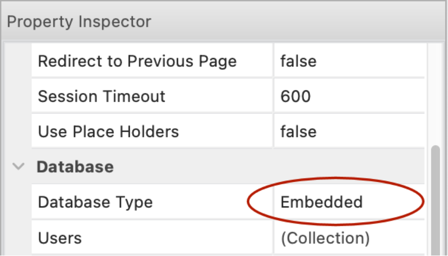
- New feature: Added support for user roles to 'embedded' database type. Previously this feature was only available for MySQL. This makes the 'embedded' database is a good alternative if you do not want to set up a database on the server but still want user role (group) support.

Online tutorial:
https://quickandeasywebbuilder.com/login_embedded_db.html
SEO Assistant
- New feature: Added "SEO targeting" functionality. This option uses the keywords from the page properties (Meta tags) and checks whether these words are actually used in the page title, description and main heading (h1).

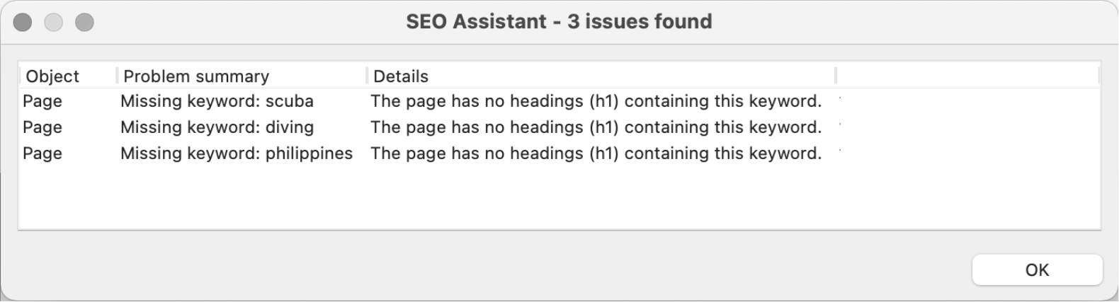
- New feature: Added check for page title length. The recommended number of characters for the page title is between 30 and 60 characters. The SEO Assistant will display a warning if the title is too short or long.

Online tutorial:
https://quickandeasywebbuilder.com/seo_assistant.html
PayPal Shopping Cart
- New feature: Added 'Use shipping based on weight' option. This option can be used instead of PayPal's default shipping options. The shipping fee is calculated locally and displayed in the cart instantly (instead of at checkout only).


Demo:
https://quickandeasywebbuilder.com/support/qwb10tryouts/qwb10_paypalshoppingcart.html
- New feature: Added the ability to set the minimum order quantity. A (user definable) message can be displayed if the quantity is too low.

- New feature: Added 'transition' properties. This specifies the timing and duration for the hover transition.

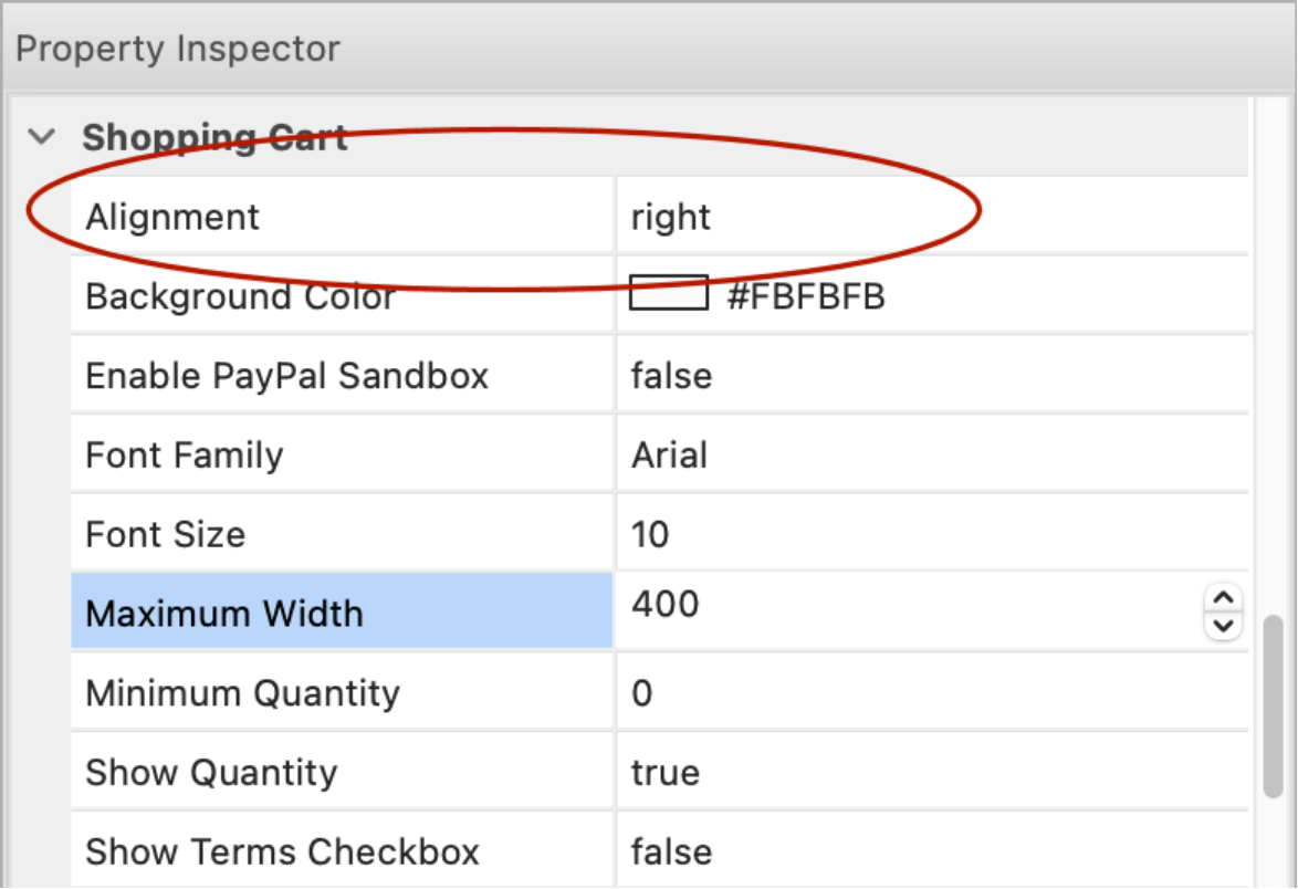
- New feature: Added 'alignment' property to the PayPal Shopping Cart.
This can be used to display the shopping cart at the left or right side of the browser window, instead of centered. The ‘maximum width’ property specifies the width of the panel.

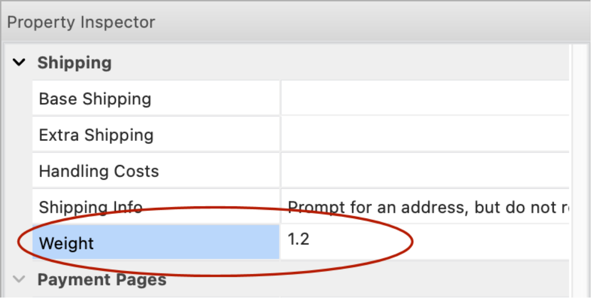
PayPal Buttons
- New feature: Added 'Weight' property to shipping section. This option is meant to be used in combination with the 'PayPal Shopping Cart' widget to calculate the shipping costs, it overrides the default PayPal shipping settings (based shipping, extra shipping and handling). The reason why this was added is because if you use the standard PayPal shipping then it's not possible to display the complete costs until the customer checks out. The number represents the weight of the product. Do not include weight units like lb, oz or kg.
Responsive Text
- New feature: Added "Responsive Text" object. This is a simplified text object. It only supports one type of font, color etc. per object. This makes the object easier manageable in complex layout (for example when using style or dark mode). Unlike the standard text object, styles/classes apply to the entire object, not just the selected text. Also, the object produces cleaner HTML output, because it does not use any inline styles.

Main differences between standard text and responsive text:
Text
- multiple styles, colors, font-family, font-size.
- optionally responsive (different font sizes in breakpoints)
- more output options (like output as image, font-size fine tuning)
- supports images and emojis.
- uses inline styles for formatting individual characters.
Responsive Text
- one style, color, font-family, font-size
- responsive by design (different font sizes in breakpoints)
- easier style setup, the style applies to the entire object
- no inline styles -> optimized HTML/CSS output.
Heading
- Improved: Text based animations (from the Animation Manager) are now applied to the inner <div>. This makes animations like letter spacing and text shadow more useful.
Upgraded to Bootstrap 5
All built-in Bootstrap widgets have been rewritten to use Bootstrap 5. Bootstrap 5 no longer uses jQuery and has many other improvements.
Also, many jQuery UI objects now have a Bootstrap alternative. For example, tooltips, progress bar, checkbox, radio button etc. More details are available later in this document.
What is the difference between Bootstrap and jQuery UI?
Bootstrap is a modern UI framework based on modern browser functionality.
jQuery UI is an older UI framework based on JavaScript, uses themes. jQuery UI relies on jQuery, and jQuery UI themes and uses JavaScript for animation so it has more impact on the performance of the page. Bootstrap is lightweight and only uses JavaScript when necessary, it uses CSS styling and for animation.
jQuery UI size: approx. 424 KB (jQuery, jQuery UI and theme files)
Bootstrap size: approx. 77 KB (bootstrap.min.js, popper.min.js)
Also, Bootstrap is actively maintained, jQuery UI is no longer under development.
jQuery UI website: https://jqueryui.com/
Bootstrap website: https://getbootstrap.com/
Card
- New feature: Added support for 'Motion Effects' (scroll effects, entrance animations, mouse effects) for individual card items.


- Improved: Card Popover now uses Bootstrap 5. No longer depends on jQuery. All code has been rewritten to remove the jQuery dependency.
https://getbootstrap.com/docs/5.2/components/popovers/
- New feature: Added the ability to use scroll transitions on individual card items.
Demo:
https://quickandeasywebbuilder.com/support/qwb10tryouts/qwb10_card_motioneffects.html
- Improved: Added the ability to use 'onscrollreveal' events on individual card items.
- Improved: The 'Alignment' property of the card is now responsive, so it can have a different value in breakpoints.
- Improved: Added “recently used colors” to color picker in card item editor.
Card Container
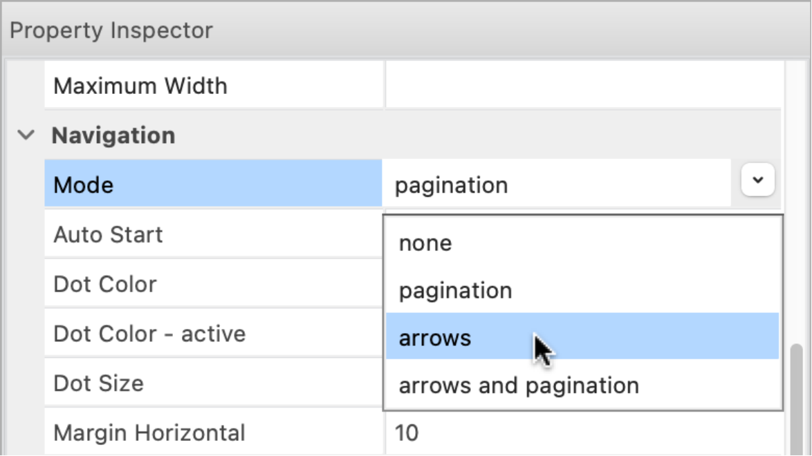
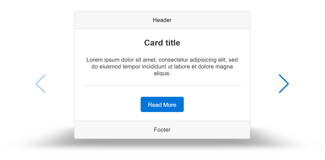
- New feature: Added 4 new layout modes:
- coverflow
- stack
- cube
- flip.
All new modes support pagination and slideshow mode (auto start).

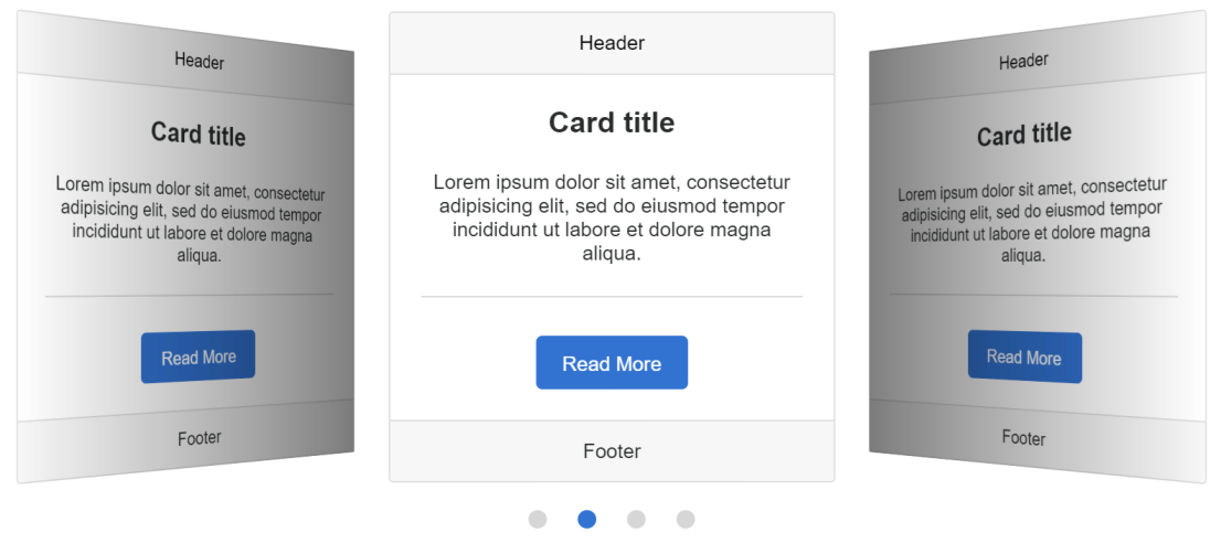


- New feature: Added an option to add navigation arrows to carousel, coverflow, stack, cube and flip mode.
Demo:
https://quickandeasywebbuilder.com/support/qwb10tryouts/qwb10_cardcontainer.html
Layout Grid
- Improved: It is now possible to set the left and right margin of the layout grid.
This may be useful to make the outer spacing of the grid the same as the gutter.


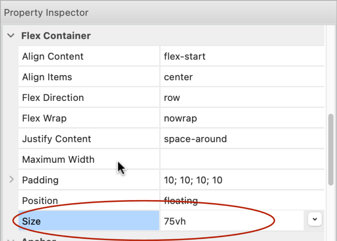
Flexbox Container
- Improved: Implemented responsive height.
The height property can now have a different value in breakpoints.
Flex Grid
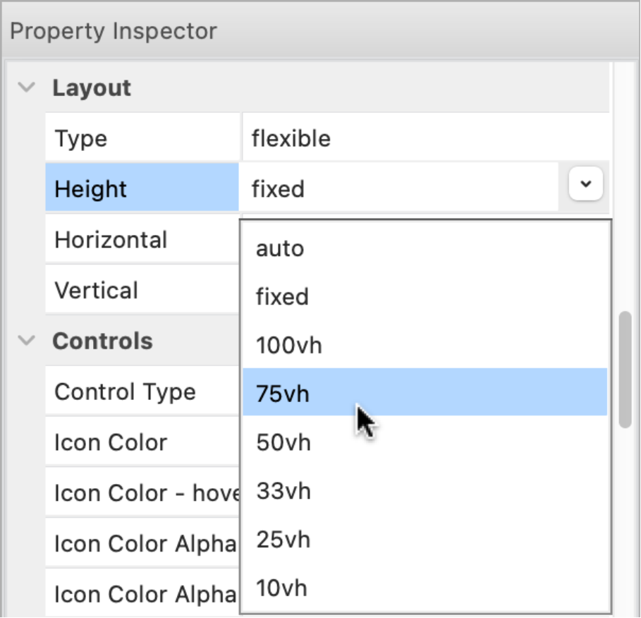
- New feature: Added new height options: 75vh, 33vh, 25vh and 10vh (vh = viewport height).
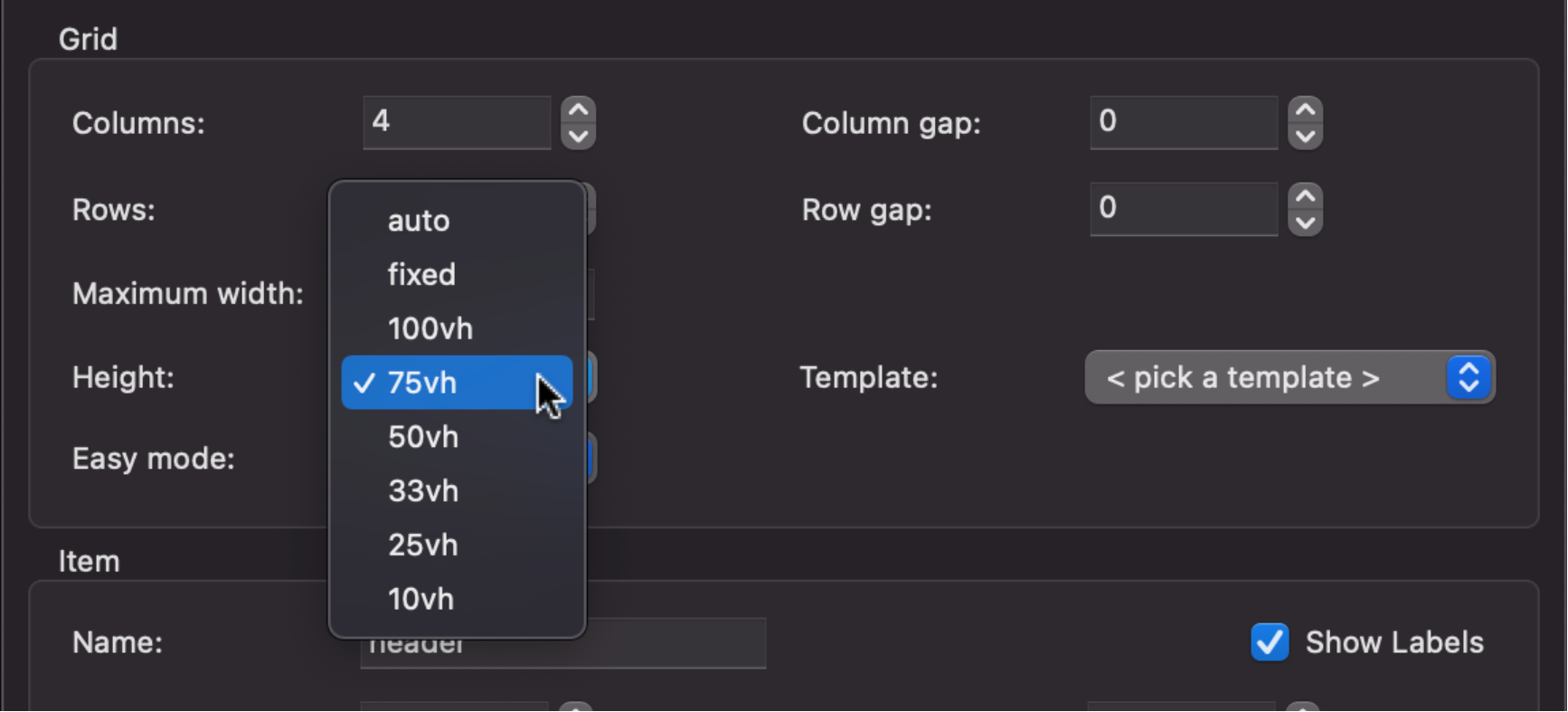
- Improved: Implemented responsive height. The height property can now have a different value in breakpoints.
- New feature: Added support for events, animations, transitions and motion effects.
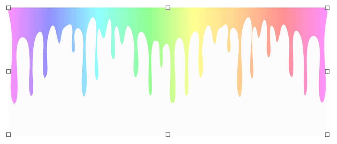
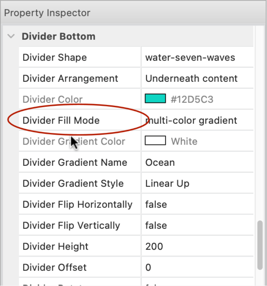
Shape Dividers
- New feature: Added support for image background and gradients. Note that SVG (which is used for dividers) does not support all CSS background options. For example, background alignment/sizing functionality is currently very limited in browsers.

Demo:
https://quickandeasywebbuilder.com/support/qwb10tryouts/qwb10_shape_dividers.html
- New feature: Added 7 new divider types: water-two-layers, water-three-layers, water-four-layers, water-five-waves, water-six-waves, water-seven-waves, water-eight-waves.
Of course the colors are fully customizable.

Carousel
- New feature: Added the ability to use icon libraries for navigation controls. With properties for icon color, alpha value and icon size. Icons are published in SVG format.


- New feature: Added new height options to flexible carousel: 75vh, 33vh, 25vh and 10vh (vh = viewport height).
- Improved: In flexible mode it's now also possible to set the position of the navigation controls (left, right, top, bottom and offset in percentages)
Demo:
https://quickandeasywebbuilder.com/support/qwb10tryouts/qwb10_carousel.html
- Improved: Carousel / flexible now uses Bootstrap 5. No longer depends on jQuery.
https://getbootstrap.com/docs/5.2/components/carousel/
- Improved: If a Carousel is added to a page with flexible layout (a page that already has a layout grid, flexbox or flex grid) then the type is automatically set to 'flexible'.
Slideshow
- New feature: Added the ability to use icon libraries for navigation controls. With properties for icon color, alpha value and icon size. Icons are published in SVG format.

- Improved: SlideShow Carousel now uses Bootstrap 5. No longer depends on jQuery.
Progressbar
- New feature: Added Bootstrap progress bar. This uses Bootstrap's progress bar instead of jQuery UI. The Bootstrap progress bar does not use JavaScript for rendering and is therefore much smaller.
https://getbootstrap.com/docs/5.2/components/progress/


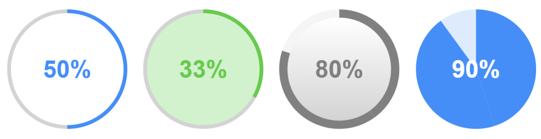
- New feature: Added Circle type. This renders a circular progress bar. The value can also be rendered as pie.

- New feature: Added 'stripes' property. This applies diagonal stripes to the background of the value. The stripes can also be animated.


- New feature: Added the ability to display text, instead of percentages.

- New feature: Added transition properties. This specifies the transition timing and duration when the value changes.

- New feature: Added 'border width' property to set the border size of the object.

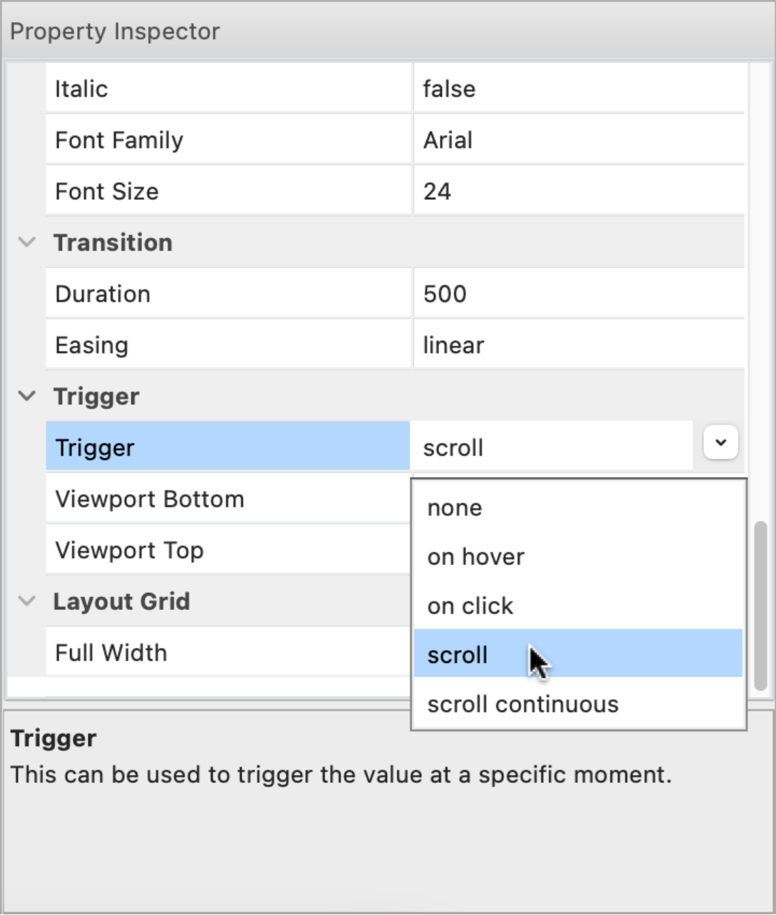
- New feature: Added 'trigger' functionality. This can be used to trigger the value at a specific moment. For example, then the progress bar is scrolled into the viewport or via events. Also supports scroll continuously this changes the value of the progress bar based on the scroll position of the scrollbar.
Online tutorial:
https://quickandeasywebbuilder.com/progressbar.html
Demos:
https://quickandeasywebbuilder.com/support/qwb10tryouts/qwb10_progressbar_overview.html
https://quickandeasywebbuilder.com/support/qwb10tryouts/qwb10_progressbar_trigger.html
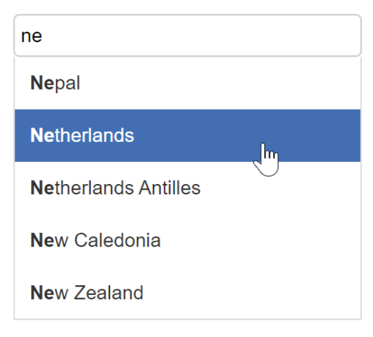
Auto Complete
- New feature: Added Bootstrap inspired auto complete mode. This offers a lightweight alternative for jQuery UI's bulky script.
- New feature: Added support for 'disable', 'auto focus' and 'read-only' properties.
- New feature: Added 'focus color' property.
- New feature: Added 'place holder color' property. Specifies the text color of the place holder text.

- New feature: Added the ability to set the text alignment.
- New feature: Added the ability to set padding of the auto complete list items.

Online tutorial:
https://quickandeasywebbuilder.com/autocomplete.html
Demo:
https://quickandeasywebbuilder.com/support/qwb10tryouts/qwb10_auto_complete.html
Tooltip
- New feature: Added support Bootstrap tooltips as alternative for jQuery UI. https://getbootstrap.com/docs/5.2/components/tooltips/
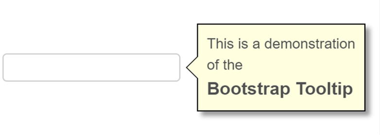

Bootstrap tooltips can be triggered via hover, click, focus or manually. With more than 35 'show' animations!

- New feature: Added the ability to show/hide/toggle tooltips via events.

This option can be useful, for example, to show a hint on how to display the menu.

- New feature: Added alignment options.


- New feature: Added 'Animation duration' property.
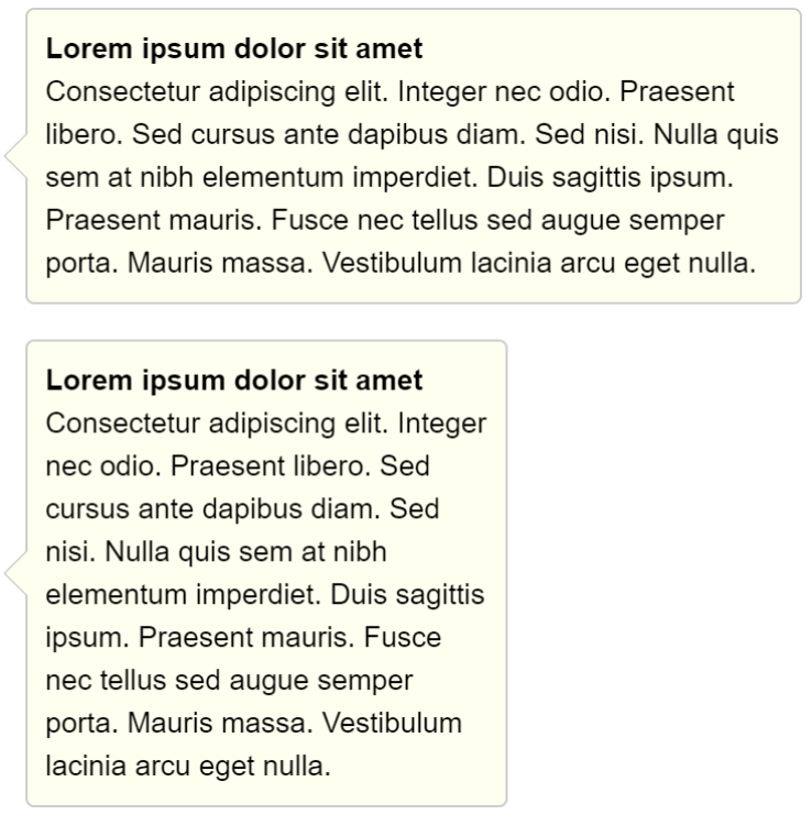
- New feature: Added the ability to set the background mode (transparent, solid, gradient, multi-color gradient, image). Previously only solid was supported.

- New feature: Added 'Maximum width' property. This specifies the maximum width of the tooltip (before text wraps to the next row).

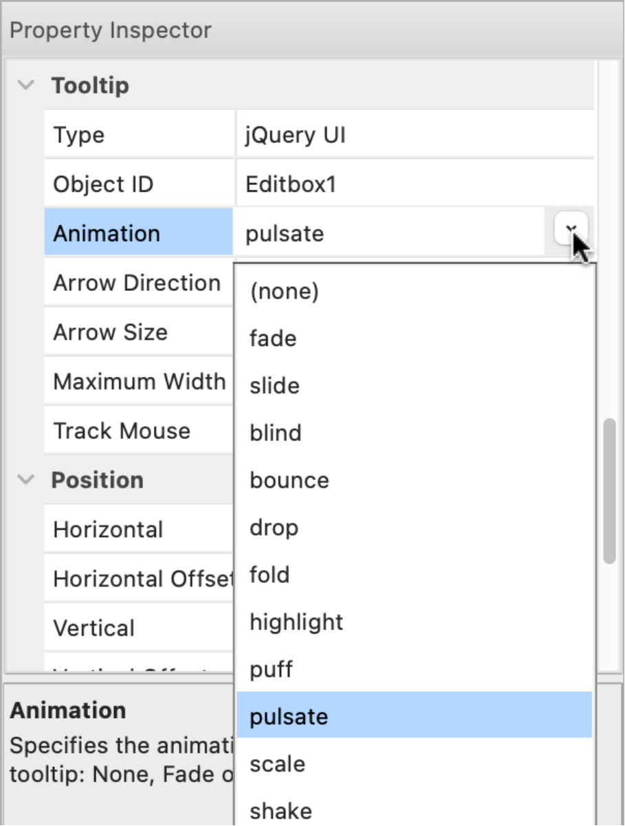
- New feature: Added 9 new animations to jQuery UI tooltip: blind, bounce, drop, fold, highlight, puff, pulsate, scale, shake. Also, the slide animation is now direction aware, which means that it moves in the direction of the tooltip's arrow.
Online tutorial:
https://quickandeasywebbuilder.com/tooltip.html
Demo:
https://quickandeasywebbuilder.com/support/qwb10tryouts/qwb10_tooltips.html
Dialog
- New feature: Added 'one-time popup' functionality via the 'Cookie Expire Days' property. A cookie is stored on the visitor’s browser to only show the dialog once across multiple visits. Use '0' to disable cookie functionality.

- Improved: Dialog now uses Bootstrap 5. No longer depends on jQuery. All code has been rewritten to remove the jQuery dependency.
https://getbootstrap.com/docs/5.2/components/modal/
Online tutorial:
https://quickandeasywebbuilder.com/dialog.html
Demos:
https://quickandeasywebbuilder.com/support/qwb10tryouts/qwb10_dialog_animations.html
https://quickandeasywebbuilder.com/support/qwb10tryouts/qwb10_dialog_cookie.html
Tabs
- New feature: Added 'deactivate' and beforedeactivate' events. These events will be triggered when a panel gets deactivated. This can be useful, for example, to hide other elements on the page.

- Improved: Tabs / Bootstrap type now uses Bootstrap 5. No longer depends on jQuery.
https://getbootstrap.com/docs/5.2/components/navs-tabs/#tabs
Demo:
https://quickandeasywebbuilder.com/support/qwb10tryouts/qwb10_tabs.html
Accordion
- New feature: Added 'deactivate' and beforedeactivate' events. These events will be triggered when a panel gets deactivated. See also the image under the ‘tabs’ section.
- Improved: Accordion now uses Bootstrap 5. No longer depends on jQuery. All code has been rewritten to remove the jQuery dependency.
https://getbootstrap.com/docs/5.2/components/accordion/
- Improved: Accordion (Bootstrap) full header is now clickable (instead of just the text)

- Improved: Accordion arrows now use SVG images instead of PNG bitmaps. This makes coloring/theming the arrows easier and also improves the quality.
Demo:
https://quickandeasywebbuilder.com/support/qwb10tryouts/qwb10_accordion.html
Spinner
- Improved: Arrows now use SVG images instead of PNG bitmaps. This makes coloring/theming the arrows easier and also improves the quality.

Toast
- Improved: Toast now uses Bootstrap 5. No longer depends on jQuery. All code has been rewritten to remove the jQuery dependency.
https://getbootstrap.com/docs/5.2/components/toasts/
Forms
- Improved: Upgraded to PHP Mailer version 6.7.1. More details: https://github.com/PHPMailer/PHPMailer/blob/master/changelog.md
Editbox / Text Area
- New feature: Added support for 'floating labels'. With floating labels, you can insert the label inside the input field, and make it float/animate when you click on the input field.


Demo:
https://quickandeasywebbuilder.com/support/qwb10tryouts/qwb10_floatinglabel.html
Select
- Renamed: combobox has been renamed to 'select' which is the official name for this HTML element.
- New feature: Added support for 'floating labels'. For the select element the <label> is always shown.


Demo: https://quickandeasywebbuilder.com/support/qwb10tryouts/qwb10_floatinglabel.html
- New feature: Added 'Access key' property. Specifies a shortcut key to activate/focus the select element.
Radio Button
- New feature: Added 'Bootstrap' inspired radio button style.


Demo:
https://quickandeasywebbuilder.com/support/qwb10tryouts/qwb10_radiobutton.html
Checkbox
- New feature: Added 'Bootstrap' inspired checkbox style.


Demo:
https://quickandeasywebbuilder.com/support/qwb10tryouts/qwb10_checkbox.html
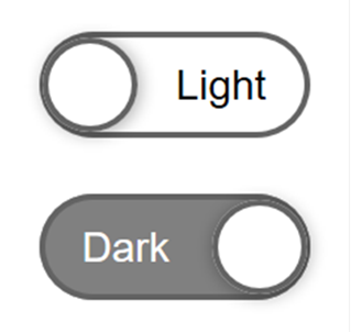
Flip Switch
- New feature: The flipswitch can now be used to toggle between light and dark color scheme by using 'darktheme_switch' for the ID property. Not only does this change the color scheme but it also stores the current state and reloads it when you revisit the page (or another page that includes the flipswitch) later!

Events
- New feature: Added 'Set Value' action. This can be used to set the value of a specific object. For example, set the value of a progressbar or input box.
'Set value' currently supports the following objects: Editbox, Text Area, Select, Checkbox, Radio Button, FlipSwitch, Spinner, Slider, Range, Button text, Heading text, Label text.

Demo:
https://quickandeasywebbuilder.com/support/qwb10tryouts/qwb10_events_setvalue.html
- New feature: Added 'Toggle Dark Theme' action. This makes it possible for the user to toggle between dark and light mode. For this to work, dark theme mode (in Tools -> Options -> HTML) should be set to 'manual'.

Demo:
https://quickandeasywebbuilder.com/support/qwb10tryouts/qwb10_events_darkmode.html
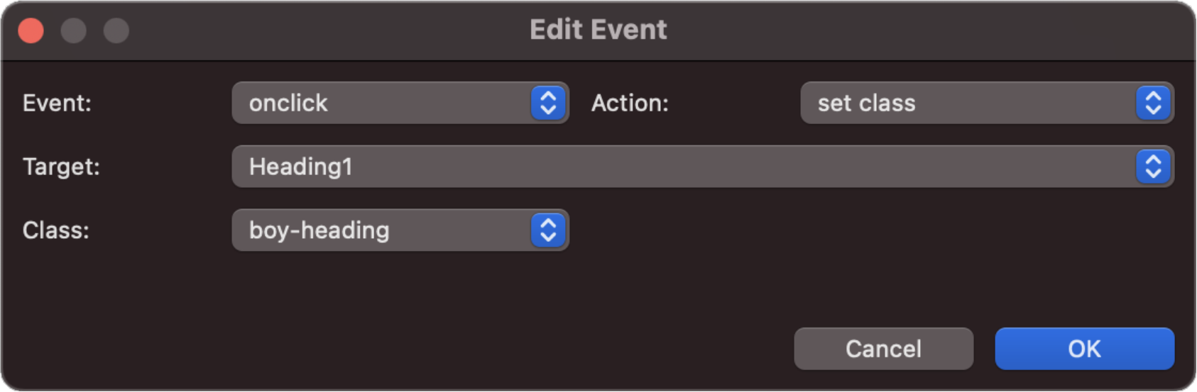
- Improved: The 'Set Class' action (previously named 'Set Style') has been redesigned. It now applies the class to the same HTML element as the 'class' property, which makes working with styles easier and more logical.
Online tutorial:
https://quickandeasywebbuilder.com/style_switcher.html
Demos:
https://quickandeasywebbuilder.com/support/qwb10tryouts/qwb10_style_switcher.html
https://quickandeasywebbuilder.com/support/qwb10tryouts/qwb10_style_switcher_buttons.html
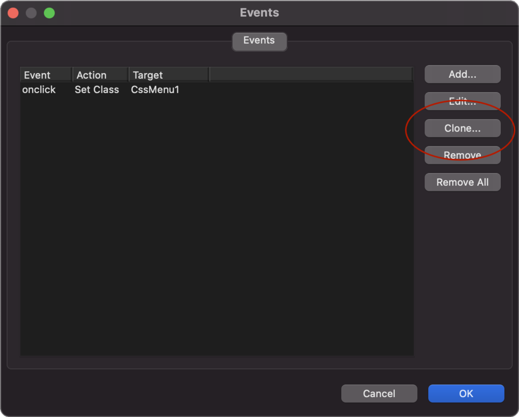
- New feature: Added 'Clone' button to quickly add a copy of the selected event.
Conditions
- New feature: Added 'Set Class' action. This can be used to set a class (style) for specific conditions. For example, based on the selected item in a 'select' object in case of a "style switcher".

Online tutorial:
https://quickandeasywebbuilder.com/style_switcher.html
Demo:
https://quickandeasywebbuilder.com/support/qwb10tryouts/qwb10_conditions.html
- New feature: Added 'Clone' button to quickly add a copy of the selected condition.

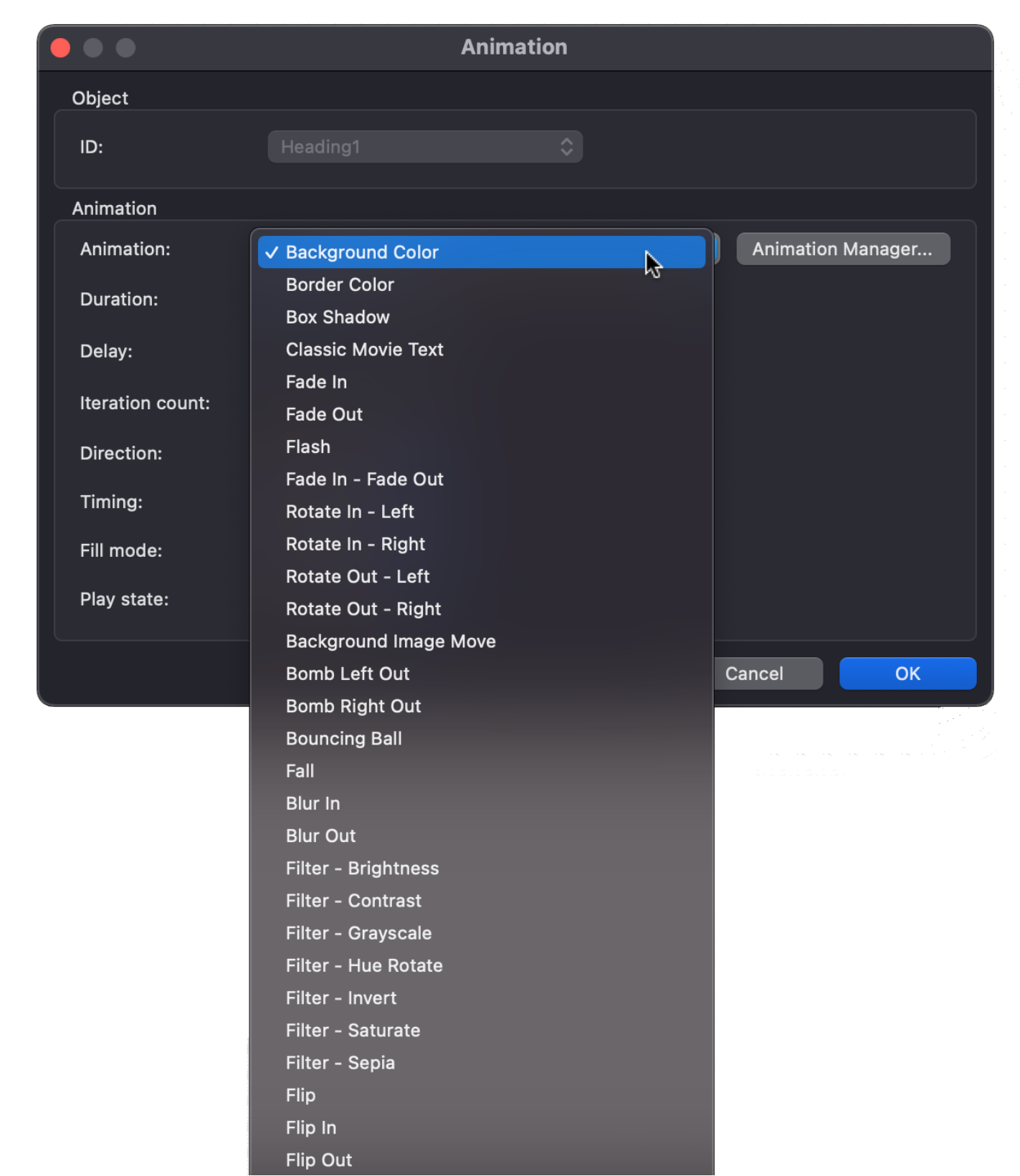
Animations
- New feature: Added 'Alias' functionality. This makes it possible to give animations an easier to remember name. Over the years we have added many new animations. Most animations have technical names like 'transform-lightspeed-in' or 'transform-swing'. By using an alias, they can now be displayed as 'Lightspeed In' and 'Swing'. Internally, the software will still use the original name (because renaming the animation name would break existing websites, that use that animation).
So, an alias is only to make it easier to identify the animation. It does not affect the published page.
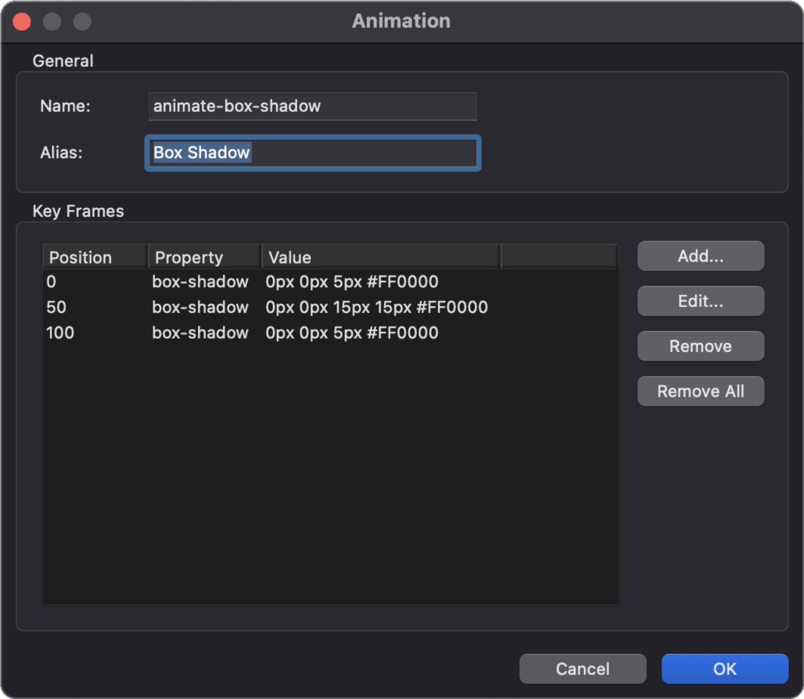
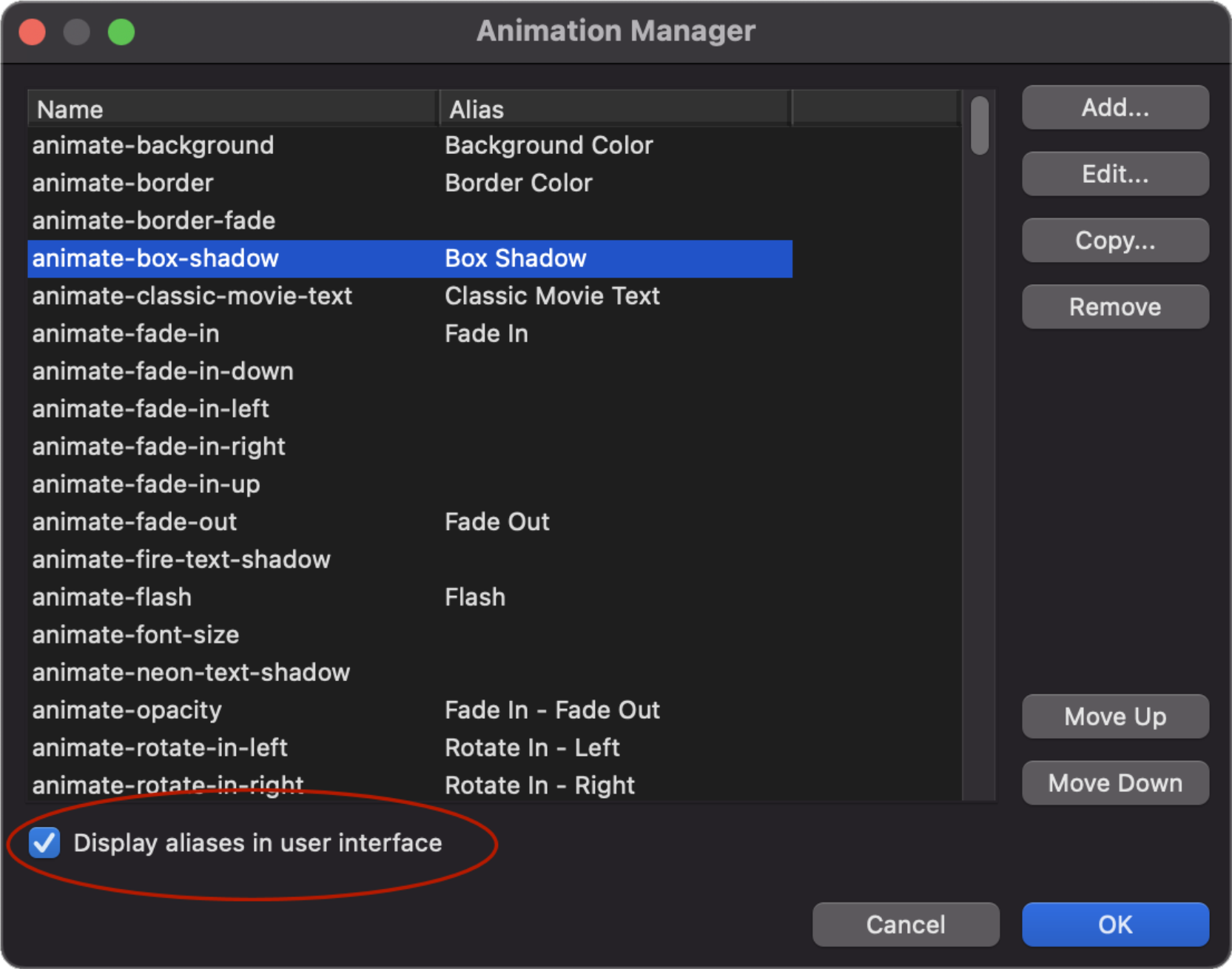
Note: when 'display aliases in user interface' is enabled then animations without an alias will not be displayed. Which can also be useful to hide less frequently used animations without removing them completely!
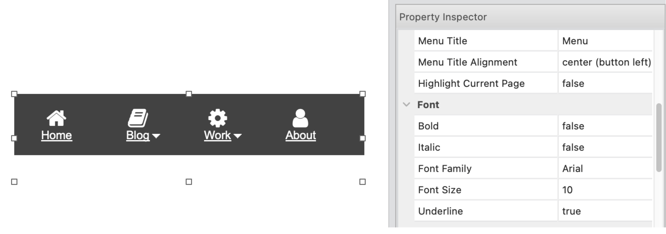
Dropdown Menu
- New feature: Added 'Dropdown Menu' item in the toolbox. The dropdown menu is a simplified version of the themeable menu without jQuery. Dropdown Menu uses Bootstrap 5 and does not depend on jQuery (unlike the themeable menu).


Tab Menu
- New feature: Added transition properties.

Snap Scroll
- New feature: Added support for horizontal scrolling.

Demo:
https://quickandeasywebbuilder.com/support/qwb10tryouts/qwb10_medieval_town.html
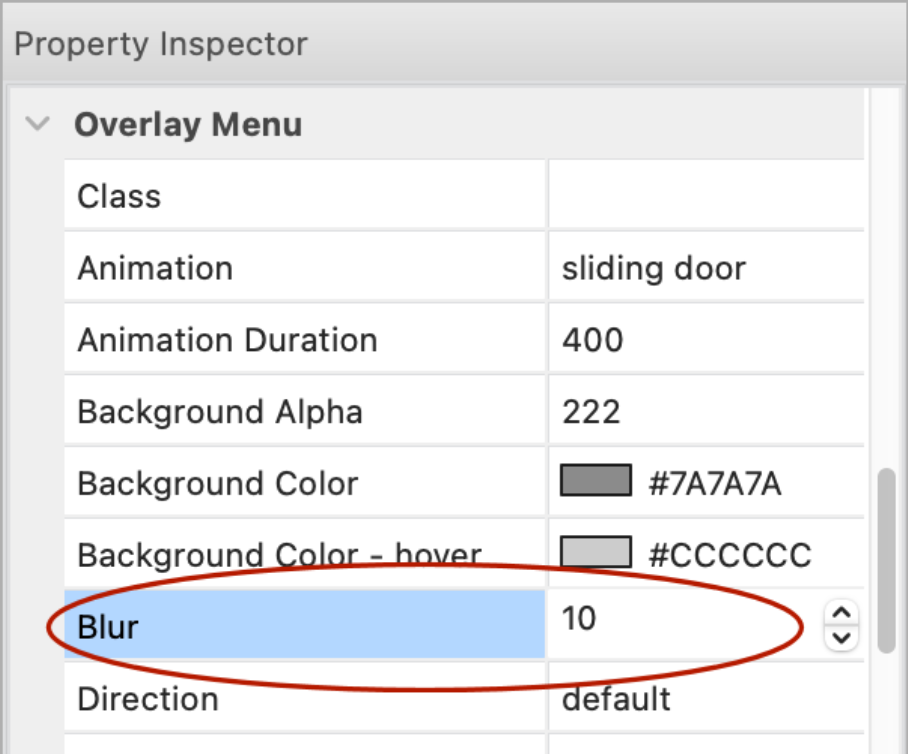
Overlay Menu
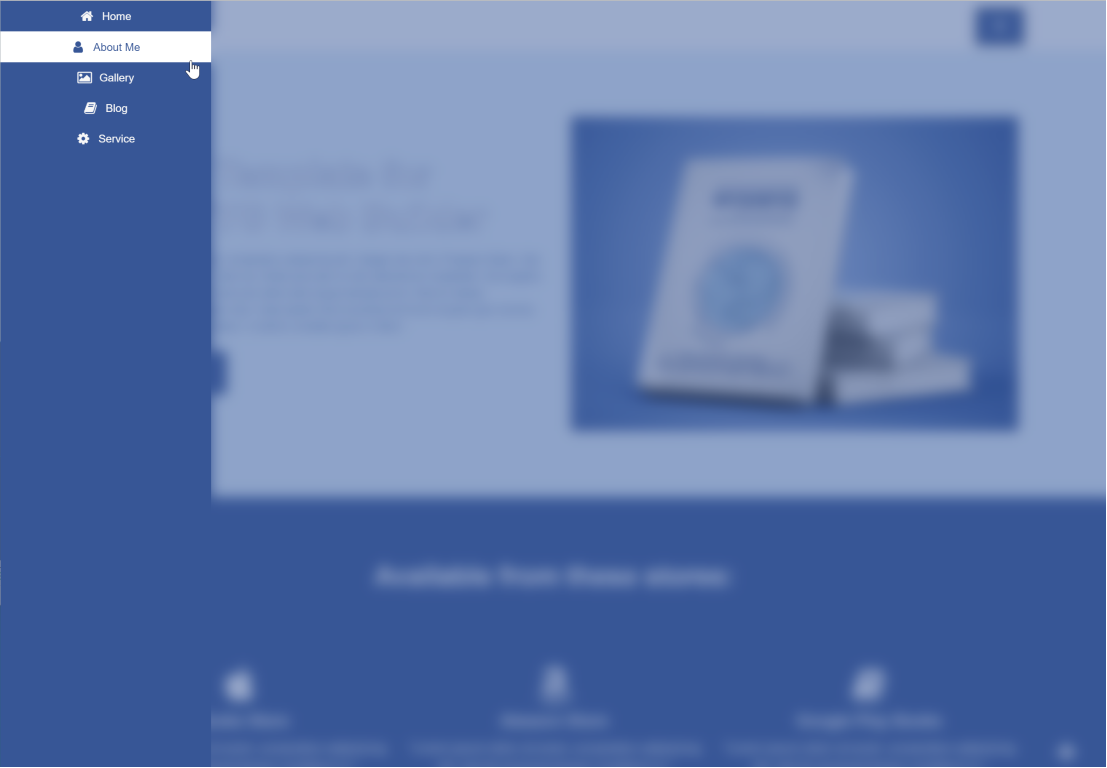
- New feature: Added 'Blur' property. This adds a backdrop blur filter to the overlay background.

Demo:
https://quickandeasywebbuilder.com/support/qwb10tryouts/qwb10_overlaymenu.html
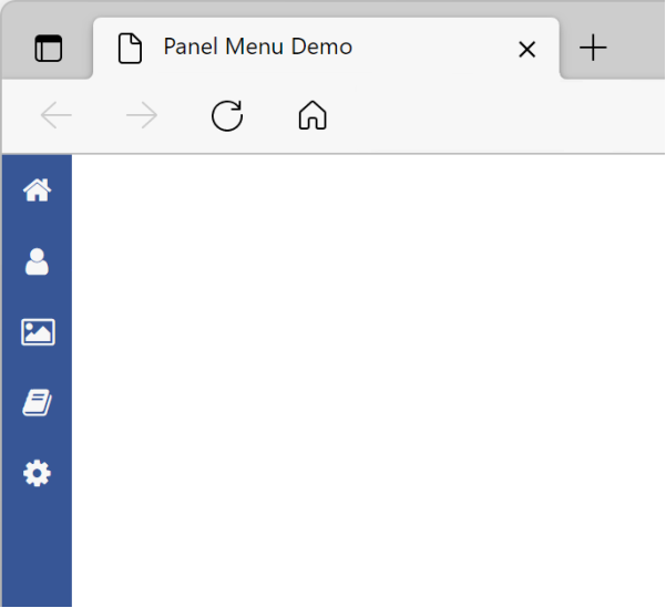
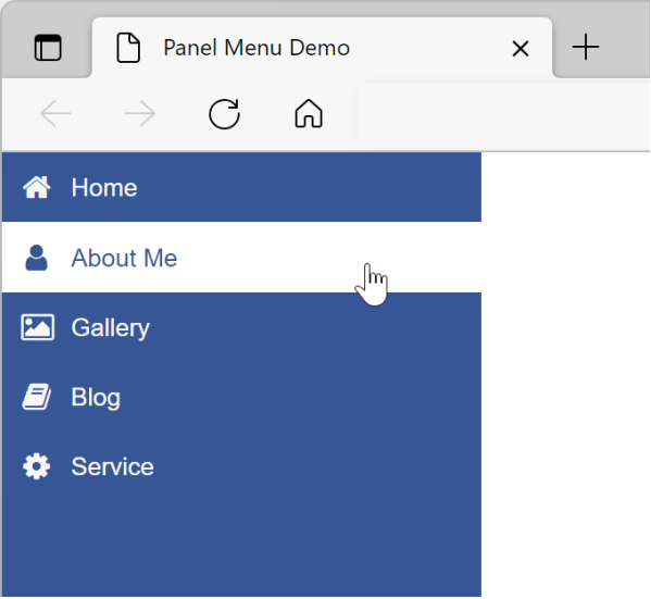
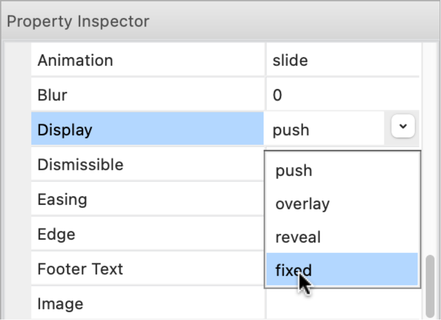
Panel Menu
- New feature: Added 'Reveal' type (in addition to 'overlay' and 'push'). In reveal mode, the panel menu will initially show the icon only and when the mouse is over the menu, it will expand to its full width. Note that this only works when the menu is at the left/right edge of the page.

Demo:
https://quickandeasywebbuilder.com/support/qwb10tryouts/qwb10_panelmenu_reveal.html
- New feature: Added 'Fixed' type (in addition to 'overlay', 'push' and 'reveal'). In fixed mode, the panel menu will always be visible. Note that this only works when the menu is at the left/right edge of the page.
Demo:
https://quickandeasywebbuilder.com/support/qwb10tryouts/qwb10_panelmenu_fixed.html
- New feature: Added 'Blur' property. This adds a backdrop blur filter to the overlay background.
Demo:
https://quickandeasywebbuilder.com/support/qwb10tryouts/qwb10_panelmenu.html
- New feature: It is now possible to hide the menu on smaller screens via the breakpoint property by specifying a negative value. For example, '-768' will hide the menu on screens smaller than 768 pixels.

Responsive Menu
- New feature: Added 'Underline' property.
CSS Menu
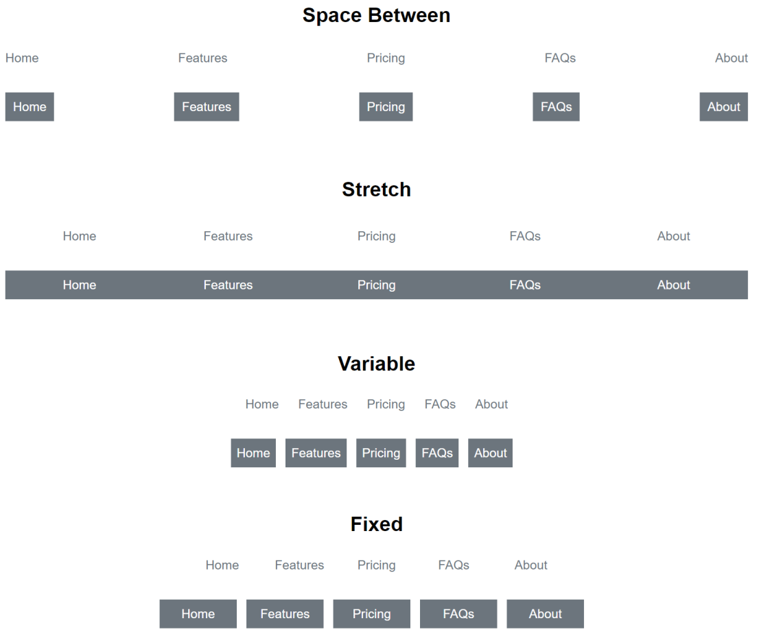
- New feature: Added 'space between' size mode. The items are evenly distributed. The spacing between each pair of adjacent items is the same.

Demo:
https://quickandeasywebbuilder.com/support/qwb10tryouts/qwb10_cssmenu.html
Themeable Button
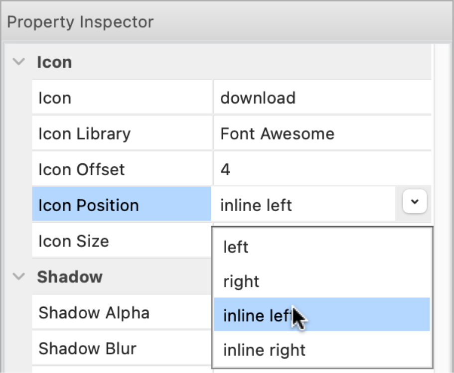
- New feature: Added the ability to use icons from icon libraries.
- New feature: Added 2 new icon align options: inline left and inline right. This will align the icon inline with the text instead of at the left or right side of the button.

Demo:
https://quickandeasywebbuilder.com/support/qwb10tryouts/qwb10_themablebutton.html
- New feature: Added the ability to set the 'icon size'. Previously the icon size was the same as the text size. Now the icon can have a different size.


Lottie Animations
- New feature: Added the ability to add a preview image. This will be displayed in the workspace as a place holder, instead of the Lottie logo.


Note that the image will not be published. It is only used during design time.
YouTube
- New feature: Added 'Mute' property. Specifies whether to mute the audio of the video. This can be useful if you want to automatically play without user interaction, because most browsers will block autoplay if the video has audio.

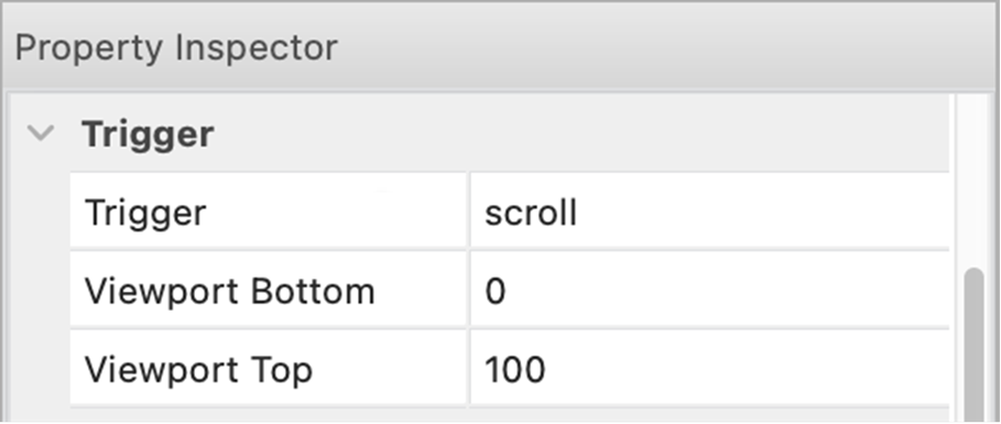
- New feature: Added 'Trigger' functionality. This can be used to start the video based on a 'trigger'. For example, then the video is scrolled into the viewport.
This also supports scroll continuously which plays the video frame by frame based on the scroll position of the scrollbar.

Demo:
https://quickandeasywebbuilder.com/support/qwb10tryouts/qwb10_youtube.html
HTML Video
- New feature: Added 'Trigger' functionality. This can be used to start the video based on a 'trigger'. For example, then the video is scrolled into the viewport.
This support, scroll continuously this plays the video frame by frame based on the scroll position of the scrollbar.

Vimeo
- New feature: Added 'Mute' property. Specifies whether to mute the audio of the video. This can be useful if you want to automatically play without user interaction, because most browsers will block auto play if the video has audio.
- New feature: Added 'Show controls' property. Specifies whether to show/hide all elements in the player (play bar, sharing buttons, etc.).

- New feature: Added 'Trigger' functionality.
Shape
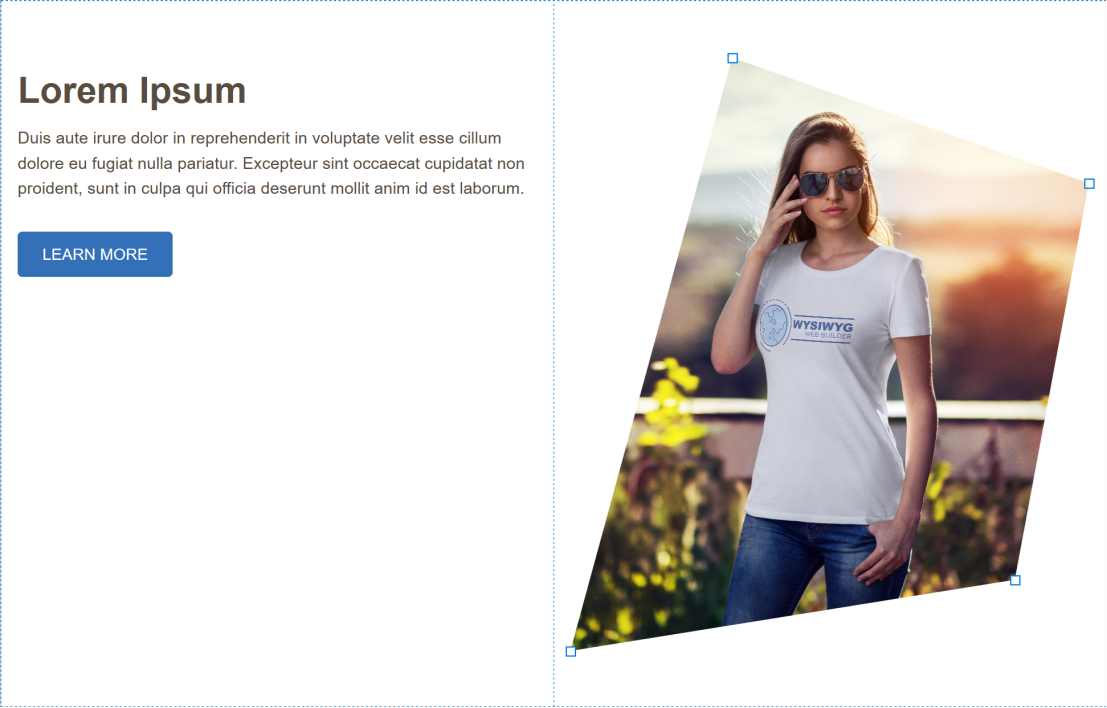
- Improved: Shapes with output format 'CSS' now use clip-path, so CSS shapes are no longer limited to rectangles and ellipses!

Note that shapes using clip-path cannot have a border.
- Improved: Background patterns of SVG shapes are now exported in vector format (instead of an image), so they take up less space and look better.

- Improved: Most gradients styles now have a decent fallback for SVG.
Demo:
https://quickandeasywebbuilder.com/support/qwb10tryouts/qwb10_shapes.html
Clip Art
- New feature: Added support for 'CSS' output format. This will output the element with clip-path and SVG. When using CSS as output, the border and background can be styled with Styles.

Polygon / Curve/ Line / Scribble
- New feature: Added support for 'CSS' output format. Basically, this generates the same output as SVG, but when using CSS it is possible to use styles. In this case, the 'text color' controls the fill of the shape.
Polygon / Curve
- New feature: The Polygon / Curve object can now be part of a layout grid. When the output is set to SVG or CSS, the polygon/curve is also responsive and scalable.

Demo:
https://quickandeasywebbuilder.com/support/qwb10tryouts/qwb10_polygons.html
Shape / Clip Art / Polygon / Curve
- New feature: Added new background size options: ‘tile’ and ‘stretch’ and ‘cover'. Unlike stretching, ‘cover’ scales the image to be as large as possible so that the background area is completely covered by the image without affecting the aspect ratio.


Icon object
- New feature: Added 'transition' properties. This specifies the timing and duration for the hover transition.

Image Hotspots
- New feature: Added 'auto' placement option to Tooltip properties. When auto is specified, it will dynamically reorient the tooltip.

- New feature: Added the ability add a border (width / color) to the tooltip.


- New feature: Added support 'border radius'.
- Improved: The tooltip arrow is now relatively sized based on the tooltip font-size.

Picture
- New feature: Added the ability to apply a stencil/mask to the picture. This works just like the stencil feature of a standard image, however in this case CSS's mask-image will be used, instead of a modifying the image. Which means that the quality of the original image will not be affected.


Photo Gallery / Slideshow
- New feature: Added support for third party GLightbox script. GLightbox (https://github.com/biati-digital/glightbox/) is a pure JavaScript lightbox (no jQuery!). It can display images and videos with optional autoplay for YouTube, Vimeo and self-hosted videos.
Demo:
https://quickandeasywebbuilder.com/support/qwb10tryouts/qwb10_glightbox.html

Rollover Image
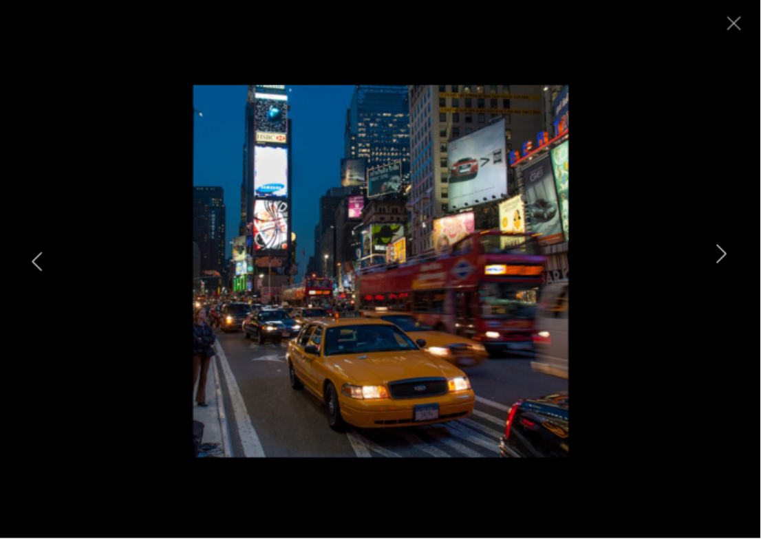
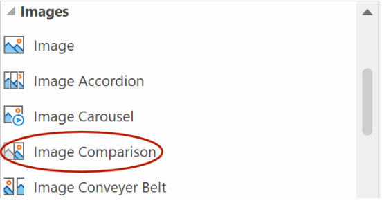
- New feature: Added 'compare' mode. This mode adds a comparison slider to the images for comparing before and after images. For example, it could be used to compare images before and after compression or editing or to demonstrate the effect of a product or service etc.

The color of the splitter can be set via the border color.

The Image Comparison option has its own icon in the toolbox for easy access.
Demo:
https://quickandeasywebbuilder.com/support/qwb10tryouts/qwb10_rolloverimage.html
Rollover Text
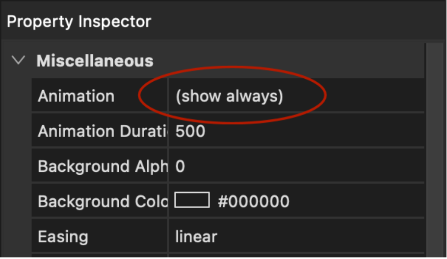
- New feature: Added 'show always' option (to animation list). When this option is selected, then the text will always be displayed.
- New feature: Added 'hide on hover' option (to animation list). When this option is selected, then the text will initially be displayed, but hides when the mouse hover over the image (inverse rollover).

Demo:
https://quickandeasywebbuilder.com/support/qwb10tryouts/qwb10_rollovertext.html
Page
- New feature: Added a quick and easy way to rearrange floating layers (layout grids, flex containers etc.) via the vertical ruler bar. When a floating layer is selected, the ruler will show 'move up' and 'move down' arrows.

- New feature: Added the ability to set a minimum font size for 'Automatically scale new objects in other breakpoints'. Previously, if the base font size was small then the scaled font could become too small to read, so now it can be limited to a more practical size.

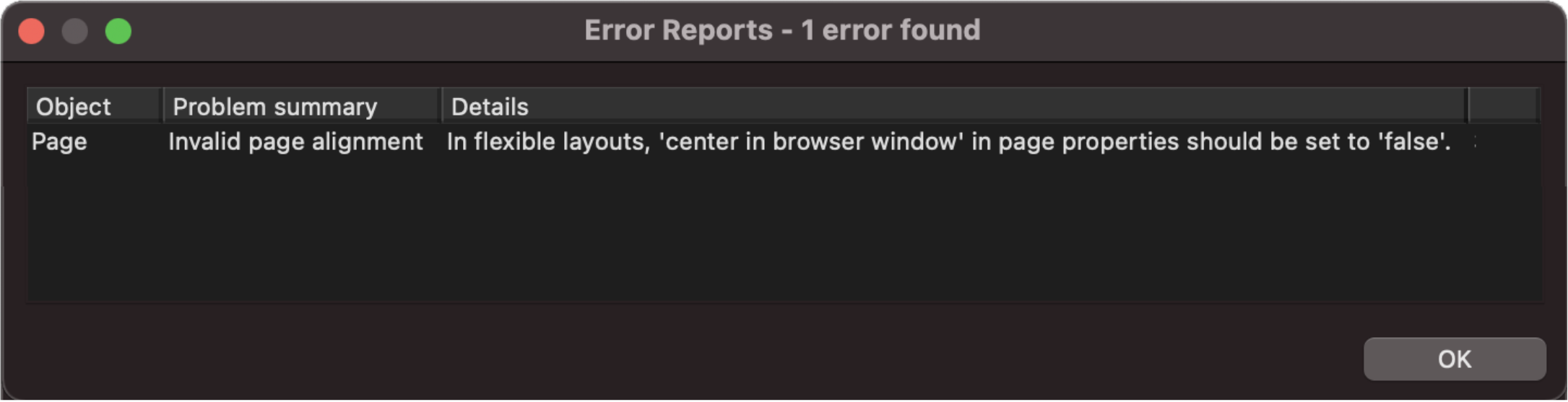
- New feature: Error Reports checks for invalid page alignment in flexible layouts. The page alignment in flexible layouts should be set to 'do not center this page'. Double click the error to open the Page Properties.
- New feature: Added global zoom functionality. This can use enabled via Preference -> Miscellaneous -> Remember zoom level between sessions.

Global Replace
- New feature: Added the ability to replace the 'class' property (style) for all pages/objects.

MacOS specific improvements
- Improved: Many tweaks in Dark mode support.
- Improved: UI controls now use system accent color for highlight.
- Improved: Added Apple Silicon (M1/M2) support.
- Improved: icons in the toolbox and toolbars are now high DPI (retina), so they have more detail and look sharper.

Blog
- Improved: Blog Carousel now uses Bootstrap 5. No longer depends on jQuery.
Other changes
- New feature: Added ‘Use optimized storage’ option. This may improve the performance of loading and saving larger projects on systems with a slower hard disk.
Note however that is also increase the memory usage during load/save!

- New feature: Added 'hide', 'hide all' and 'show all' commands to the main menu.
- Improved: dropped the '-webkit-' prefix for transform, transition, animation.
- Removed: IE compatibility property.
- Removed: Deprecated options from Media Player (Quicktime, RealPlayer and Flash).
Templates
We’ve created more than 25 new templates to demonstrate some of the new features.
https://www.quickandeasywebbuilder.com/templates2023.html

More Features
If you are upgrading from a version prior to version 8 then also check out what we’ve added in version 2, 3, 4, 5, 6, 7, 8 and 9!
https://www.quickandeasywebbuilder.com/support/qnewb9.html
and
https://www.quickandeasywebbuilder.com/support/qnewb8.html
and
https://www.quickandeasywebbuilder.com/support/qnewb7.html
and
https://www.quickandeasywebbuilder.com/support/qnewb6.html
and
https://www.quickandeasywebbuilder.com/support/qnewb5.html
and
https://www.quickandeasywebbuilder.com/support/qnewb4.html
and
https://www.quickandeasywebbuilder.com/support/qnewb3.html
and
https://www.quickandeasywebbuilder.com/support/qnewb2.html