What is new in Quick ‘n Easy Web Builder 9?
The Web is constantly evolving. Quick ‘n Easy Web Builder is kept up to date to provide you with the latest features and tools to create amazing website. Quick ‘n Easy Web Builder 9 has more than 99 new features/improvements!
This release has focus on SEO, Ecommerce, Productivity and Creativity.
Here’s an overview of some of the new features. Besides screenshots there are also links to online examples and tutorials to demonstrate the new functionality.
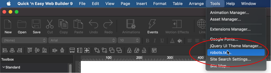
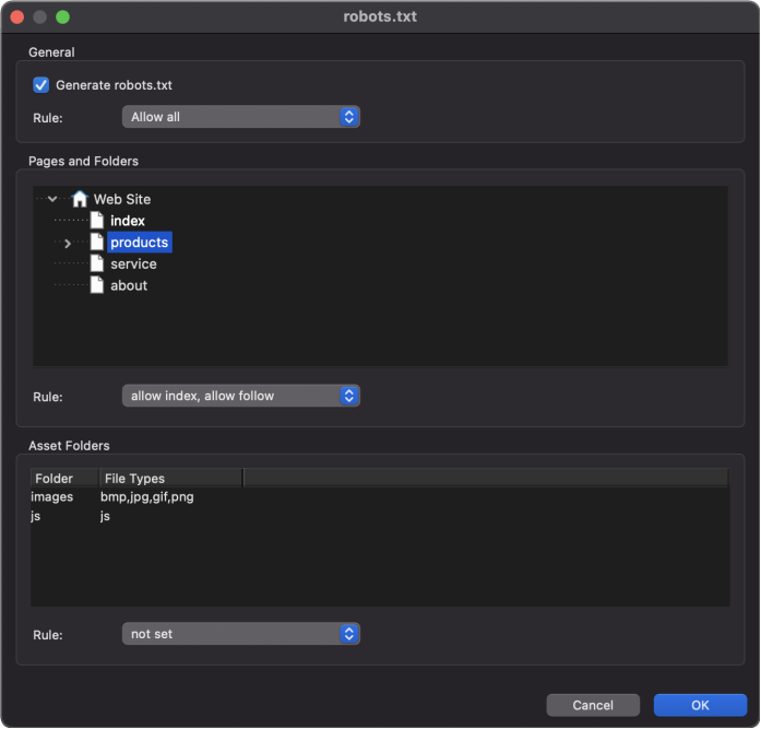
Robots.txt
- New feature: Added support for 'robots.txt'. Robots.txt is a text file with instructions for search engine crawlers. It defines which areas of a website crawlers are allowed to search. You can configure whether to allow /disallow the entire website or configure the rules for each folder individually.
Online tutorial: https://www.quickandeasywebbuilder.com/robots_txt.html
SEO Assistant
- New feature: Added SEO Assistant. This new tool helps you make your web pages more search engine friendly. The SEO Assistant scans the page for missing image descriptions, keywords, sitemap.xml/robot.txt, header tags, broken links, mobile support and more. Double clicking one of the reported issues will either open the properties (meta tags, sitemap etc.) to fix the issue or select the object in the workspace.
Currently the SEO Assistant validates:
- page
title, page description, page language
- keywords
- sitemap.xml,
robots.txt
- mobile
friendly
- structured
data for navigation
- header
tags
- image
descriptions
- broken
links
- secure
links
- large
images
- form
control labels
Online
tutorial:
https://www.quickandeasywebbuilder.com/seo_assistant.html
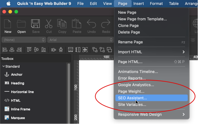
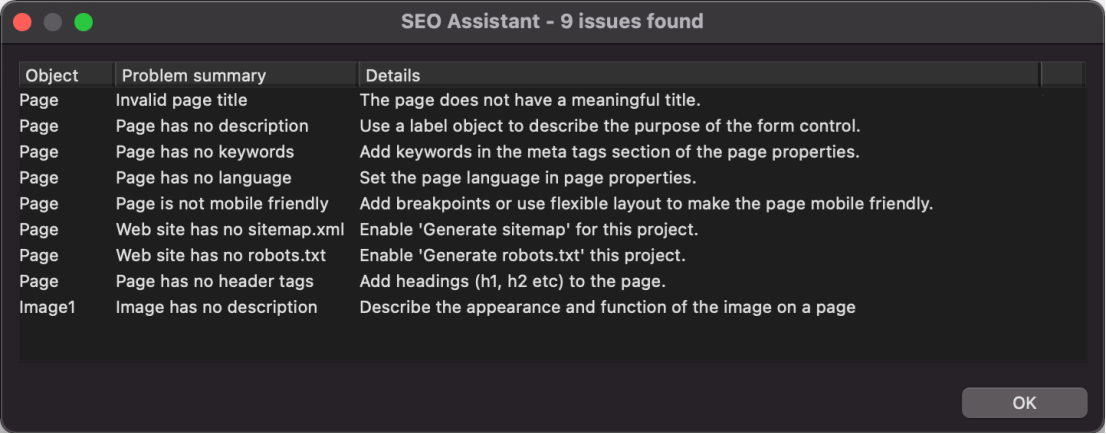
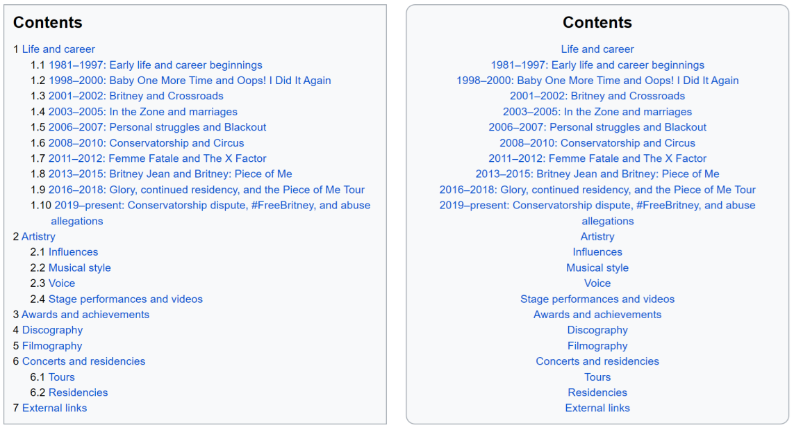
Table Of Contents
- New feature: A Table Of Contents is a list of links that lead to different sections on a page. They're particularly useful for long pages, as they highlight the critical sections of a page in order to improve the reader experience. You may know Table Of Content from websites like Wikipedia. Every time you preview or publish the page, Quick ‘n Easy Web Builder will scan the page for heading objects (H1, H2 etc.) and update the list. You can also configure the list manually.
Demo:
https://www.quickandeasywebbuilder.com/support/qwb9tryouts/qwb9_tableofcontents.html
Online
tutorial:
https://www.quickandeasywebbuilder.com/table_of_contents.html
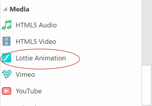
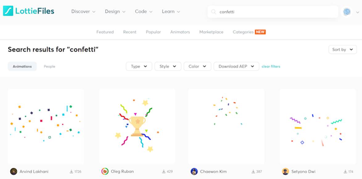
Lottie Animations
- New feature: Added support for Lottie animations. Display lightweight, scalable, and interactive Lottie animations on your websites. Visit https://lottiefiles.com/ for a huge list of free and commercial animations. Lottie Animations can be triggered automatically, on click, on hover or on scroll. It is also possible to animate frame by frame based on the scrollbar position (parallax). Animations can be used as standalone element or as background / foreground in layers and layout grids.
Demo:
https://www.quickandeasywebbuilder.com/support/qwb9tryouts/qwb9_lottieanimations.html
Online tutorial:
https://www.quickandeasywebbuilder.com/lottieanimation.html
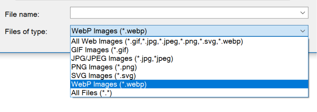
WebP Images
- New feature: Added support for WebP images. Raster image format (pronounced Weppy") developed by Google for Web graphics; designed to reduce image file sizes over standard JPEG compression while maintaining the same or similar quality; allows images to be downloaded more quickly.
https://developers.google.com/speed/webp
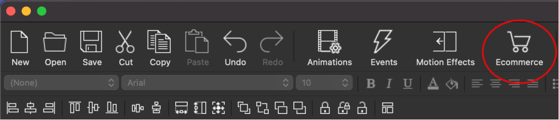
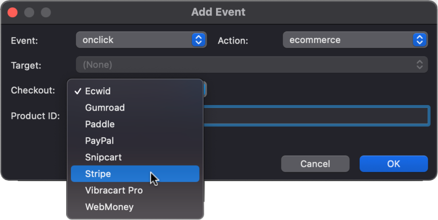
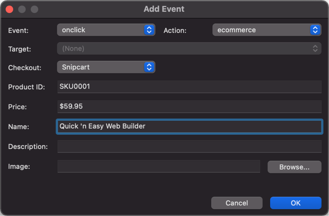
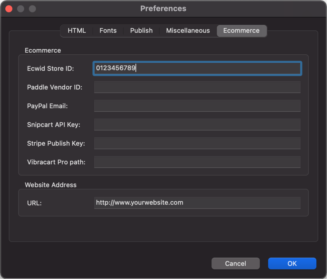
Ecommerce
- New feature: Added third party shopping cart checkout integration for Ecwid, Stripe, Snipcart, Paddle, PayPal, Gumroad, WebMoney and Vibracart Pro.
The new ecommerce options are available in the events section. So, basically this means that any image, button, text or menu item that supports events can be converted into a checkout button for the supported Payment gateways. There is also a shortcut button 'Ecommerce' on the Ribbon so you can quickly add ecommerce functionality to a button, image, shape, etc.
Online tutorial:
https://www.quickandeasywebbuilder.com/ecommerce.html
Vibracart Pro
- New feature: Added integration with Vibracart Pro. Vibracart Pro is a third-party Ecommerce solution, which can be purchased separately. It supports digital (downloads) and physical products. PayPal and / or Stripe are supported for checkout. It has support for coupons, discounts, multiple shipping plans, VAT and lot of other options. Vibracart Pro is a self-hosted, which mean that the cart runs on your own website. So, you will need to install the product on the server before you can use it.
Online tutorial: https://www.quickandeasywebbuilder.com/vibracartpro.html
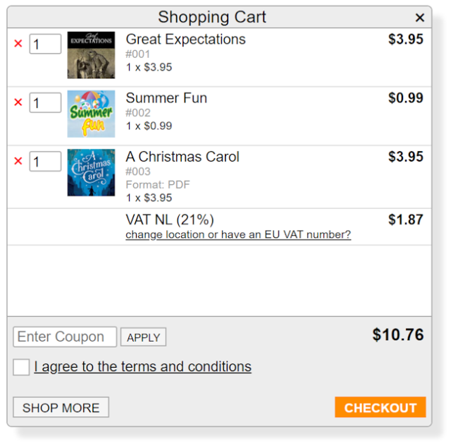
Ecwid Shopping Cart
- New feature: With the Ecwid Shopping Cart object you can easily integrate the Ecwid Ecommerce platform into your Quick ‘n Easy Web Builder website. Ecwid is an awesome e-commerce software platform that allows you to add shopping cart functionality to any current site and also get a mobile and Facebook store in one package. Ecwid Shopping Cart is a hosted Ecommerce solution. This means that the cart runs on the Ecwid website. So, you do not have to install anything on your own server. Creating a basic account is free. Upgrade options available for advanced functionality (discount coupons, product downloads, Enhanced SEO capabilities and much more).
Online
tutorial:
https://www.quickandeasywebbuilder.com/ecwid_shoppingcart.html
All functionality is based on standard Ecwid scripts, so your web shop will run on the Ecwid servers. You can setup products (like name, description, categories pricing, styling) via the Ecwid dashboard.
The following Ecwid widgets are supported:
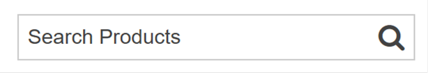
ECWID - Search Box
Search for products. The results will be displayed inside the Product Browser widget.
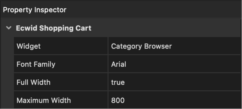
ECWID - Category Browser
Display a list of categories. This controls the content of the Product Browser widget.
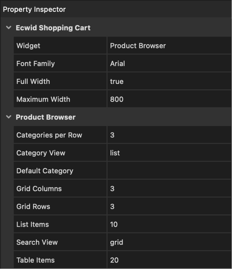
ECWID - Product Browser
This is the main container and it is mandatory; this will contain your products, categories, search results, the checkout options etc.
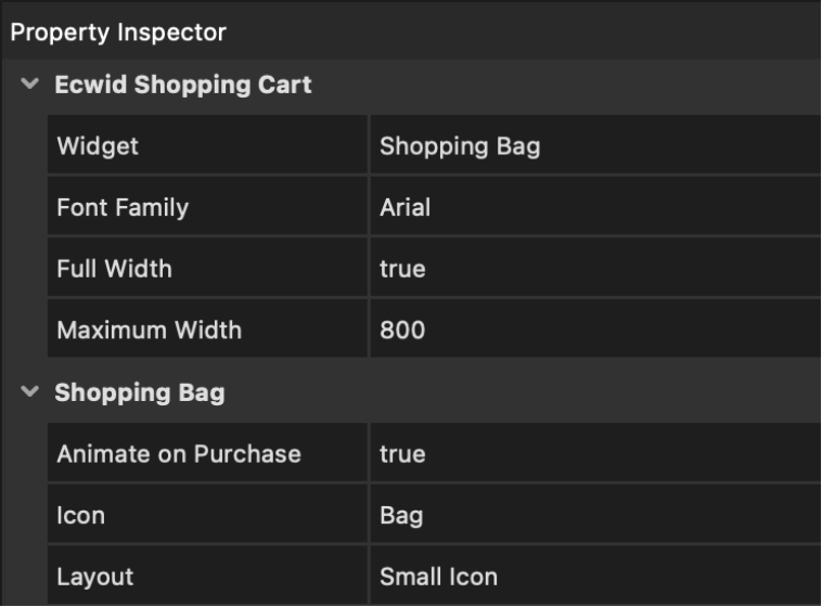
ECWID - Shopping Bag
This widget contains the Shopping Bag; when viewing products, you can Drag & Drop them to the shopping your basket.
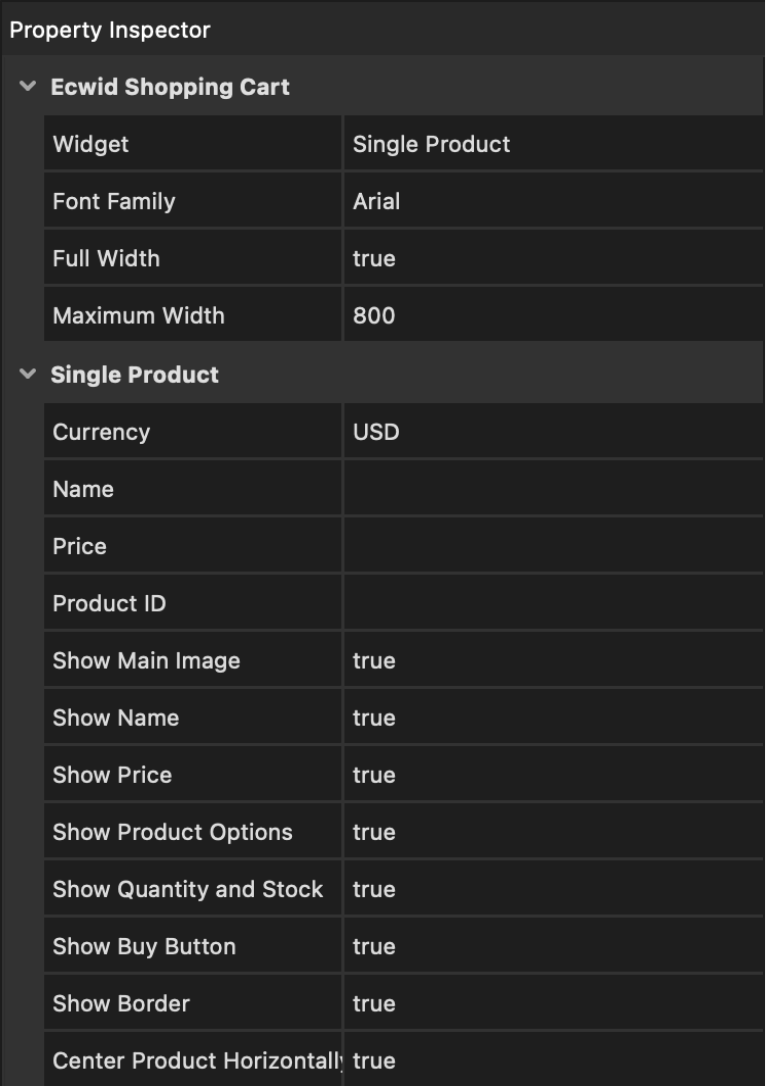
ECWID - Single Product
This makes it possible to display a single product. This can be used instead of the Product Browser widget.
Note: for performance and security reasons the workspace does not display a live preview of the web shop. The workspace will display a place holder. So, you will have to preview or publish the page to see the result.
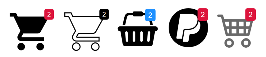
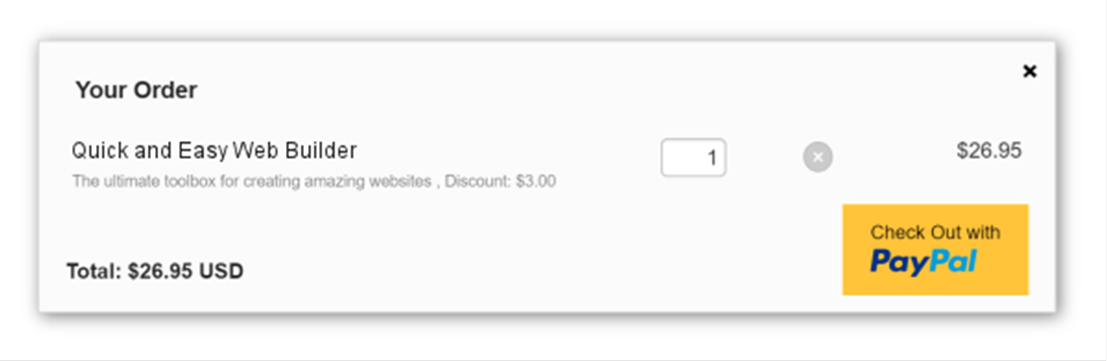
PayPal Shopping Cart
- New feature: Added 'PayPal Shopping Cart'. The PayPal Shopping Cart works in combination with the standard PayPal buttons from the Toolbox (Add to Cart and View Cart). But instead of redirecting the users to the PayPal website, the shopping cart will keep the users on your website until they checkout. PayPal Shopping Cart will show an icon on the website with a badge indicating the number of items in the cart. Clicking the icon will display a popup with the contents of the cart and a checkout button.
Demo:
https://www.quickandeasywebbuilder.com/support/qwb9tryouts/qwb9_paypalshoppingcart.html
Online tutorial:
https://www.quickandeasywebbuilder.com/paypal_shoppingcart.html

PayPal Buttons
- New feature: Added new built-in images: buy now, checkout, PayPal logo and acceptance. Al images are available in large, medium and small sizes.
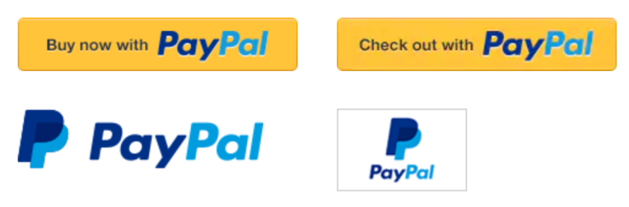
- New feature: Added 'Title' property to set the title/alt of the image.
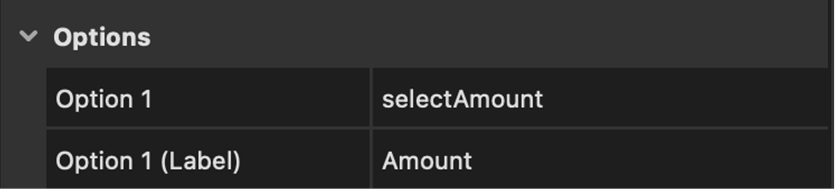
- New feature: Added the ability to add options (editbox, combobox) to PayPal buttons.
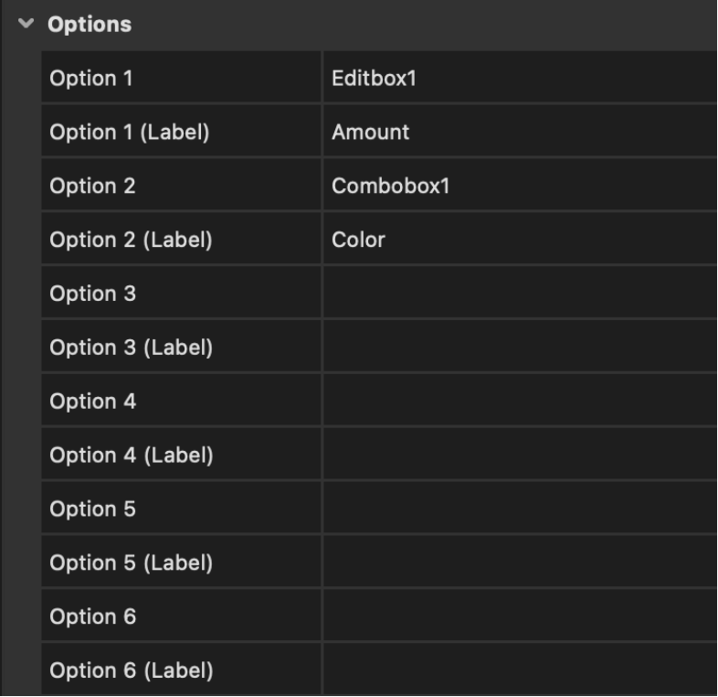
- New feature: You can now easily add options (combobox) with different prices.
1. Add a combobox
2. set the name to 'amount'
3. add items, the value is the price
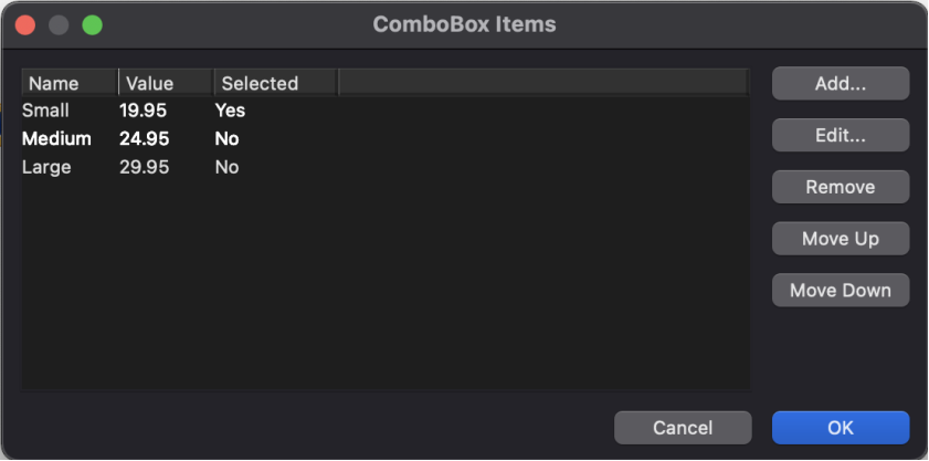
4. In the 'Options' section of the PayPal button select the ID of the combobox.
- Improved: PayPal buttons now have their own icon in the toolbox/menu: "Add To Cart", "Buy Now", "Donation", "Subscription" and "View Cart".
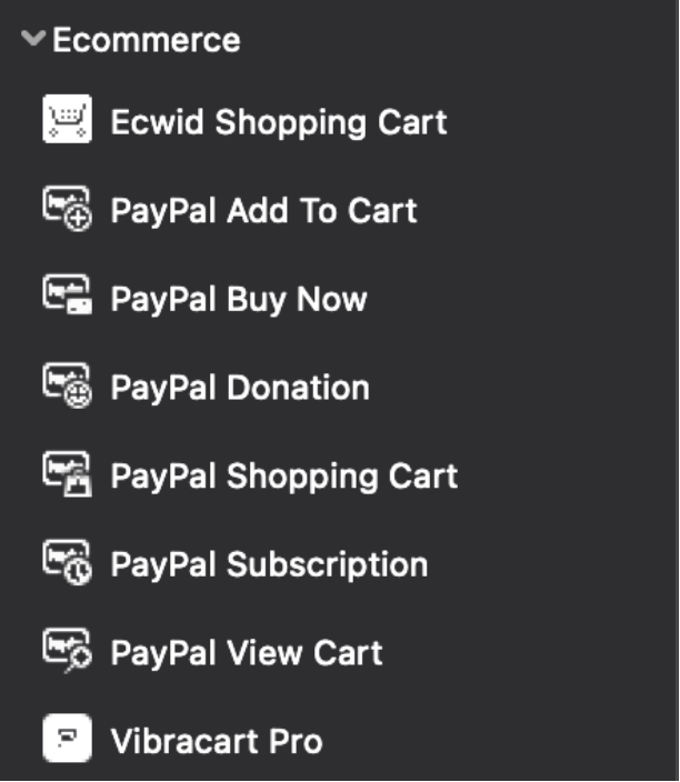
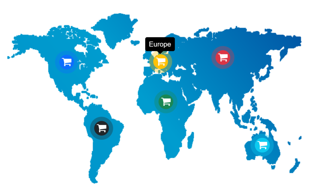
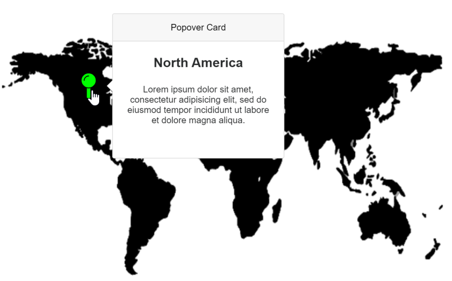
Image Hotspots
- Improved: Renamed ‘Image Map’ to ‘Image Hotspots’. The 'Image Hotspots' object is now responsive. Hotspot coordinates will automatically be recalculated when the size of the image changes in a layout grid or breakpoints.
Online tutorial:
https://www.quickandeasywebbuilder.com/imagehotspots.html
- New feature: Added the ability to show tooltips for hotspots.
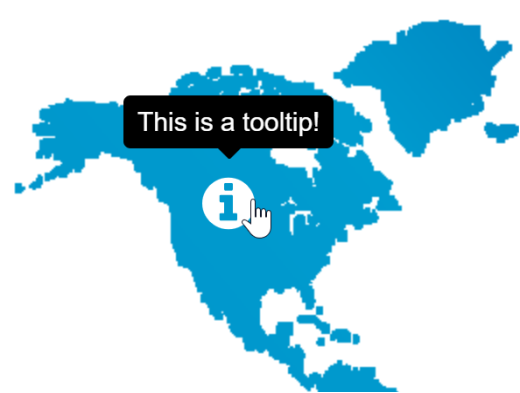
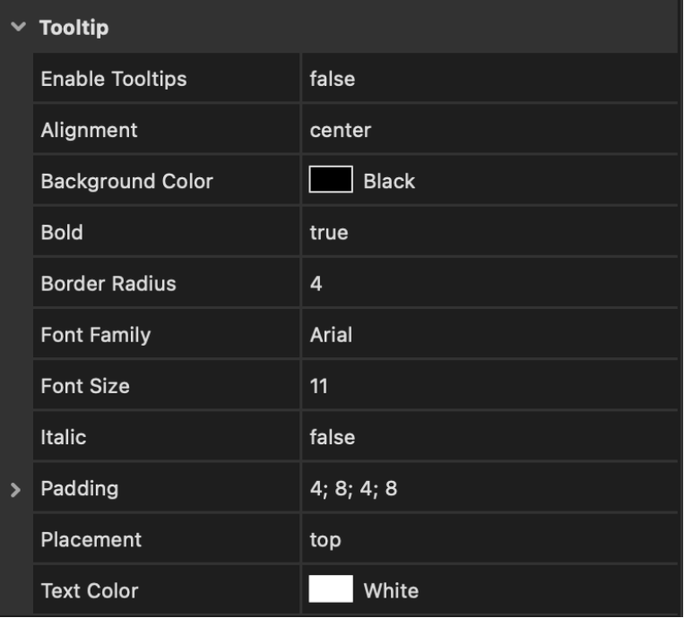
- New feature: Added new 'icon' hotspot. This makes it possible to use icons on the image map. Each hotspot can have its own icon, size, text color and background color. It also possible to add a pulsate animation to the icon to grab the attention of the visitor.
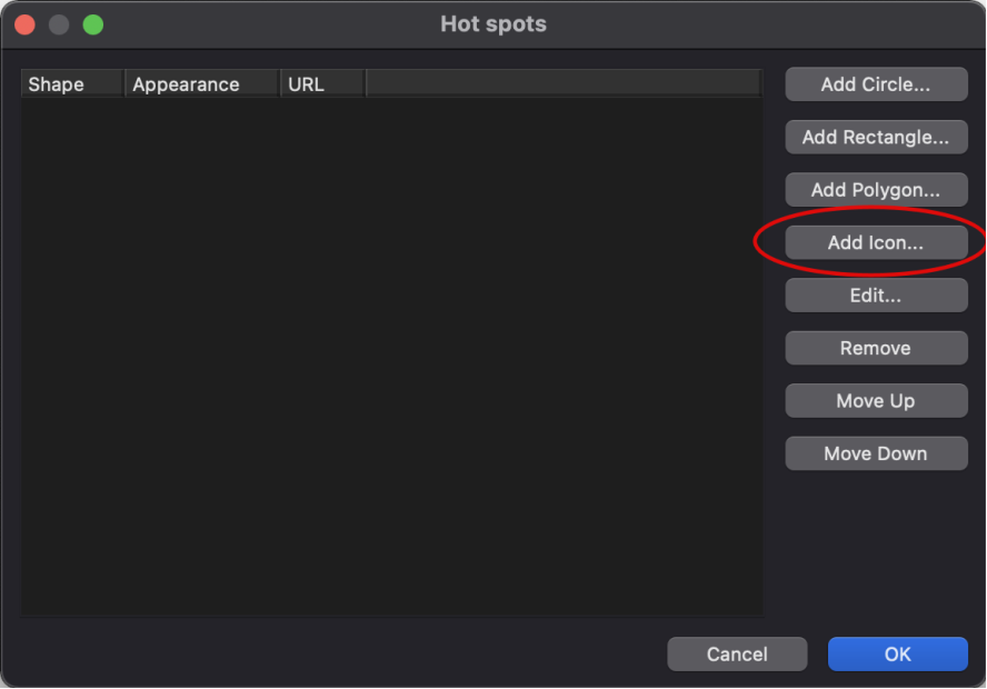
- New feature: Added support for events in hotspots.
This new functionality is demonstrated in the 'Devices' template.
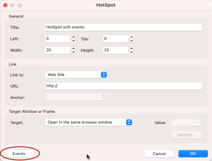
- Improved: Hotspots now have their own ID. This can be used (for example) to show a Popover Card or a Tooltip object.
Demo:
https://www.quickandeasywebbuilder.com/support/qwb9tryouts/qwb9_imagehotspots.html
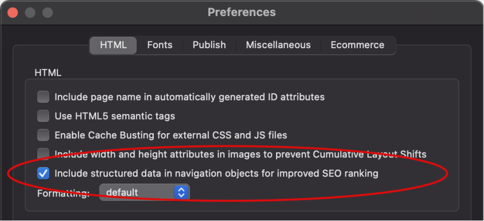
HTML
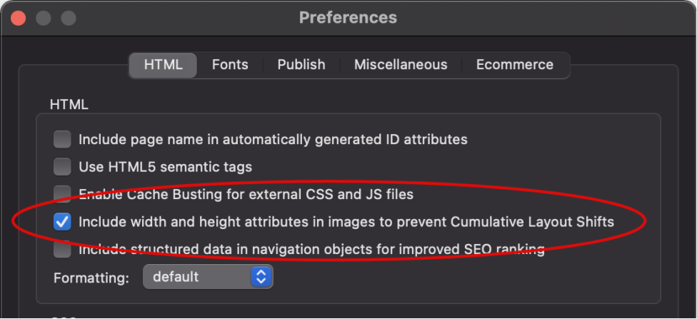
- New feature: Added “Include width and height attributes in images to prevent Cumulative Layout Shifts” option in Tools -> Options -> HTML. This specifies whether to include width and height attributes (width="800" height="600") in <img> tags in addition to CSS. This helps the browser to allocate the correct amount of space in the document while the image is loading. This may be useful to improve Google's lighthouse 'Best Practice' scores.
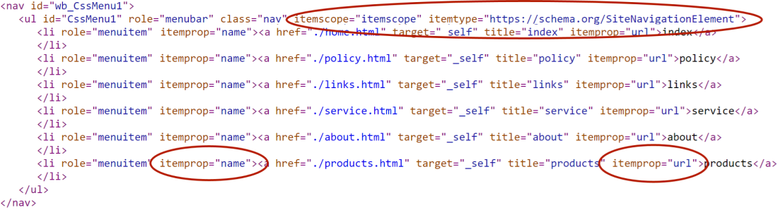
- New feature: Added “Include structured data in navigation objects for improved SEO ranking” option in Tools -> Options -> HTML. Specifies whether to include structure data (https://schema.org/SiteNavigationElement) in navigation items. This may help search engines to better understand the structure of the menus on the page.
Site Manager
- New feature: Added 'Find Referrers' tool. This will display a list of the pages that are linked to the selected page. This may be helpful if you want remove the page but are not sure which pages are referring to it. It can also be used to see which pages use the selected page as master page.
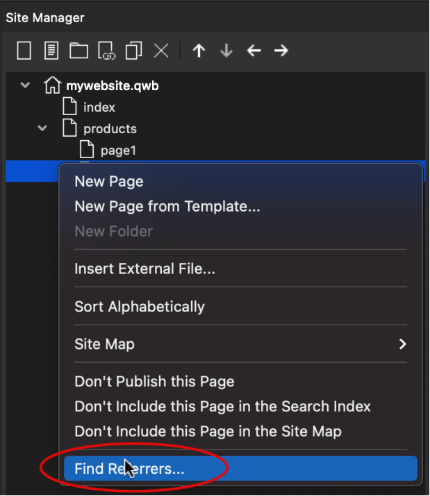
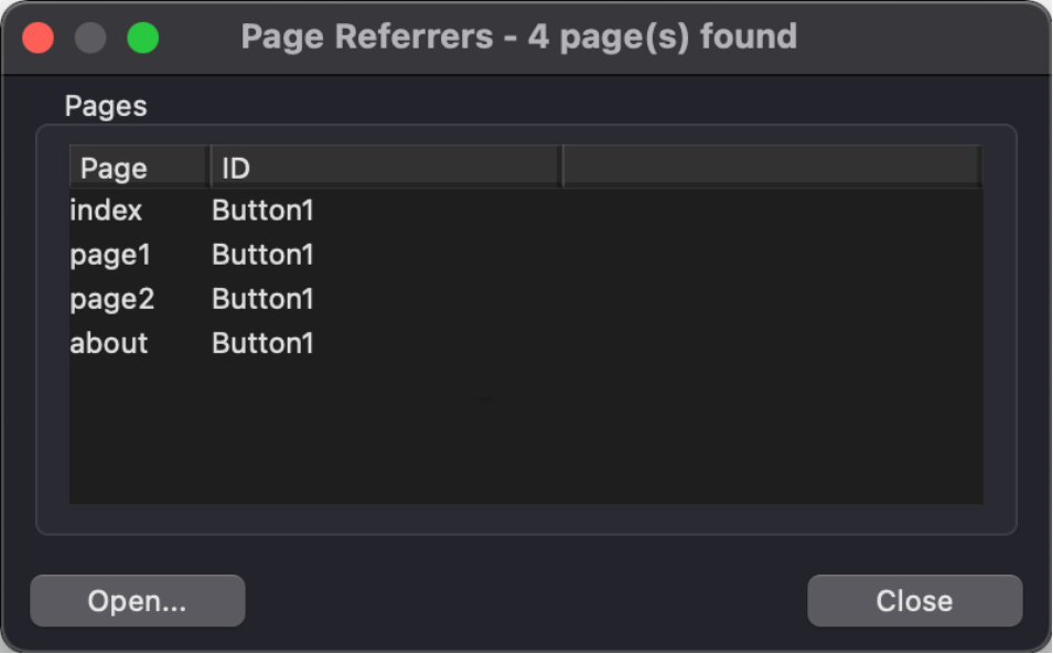
The ‘Open’ button will open the selected page.
Layers, Layout Grid, Flex container
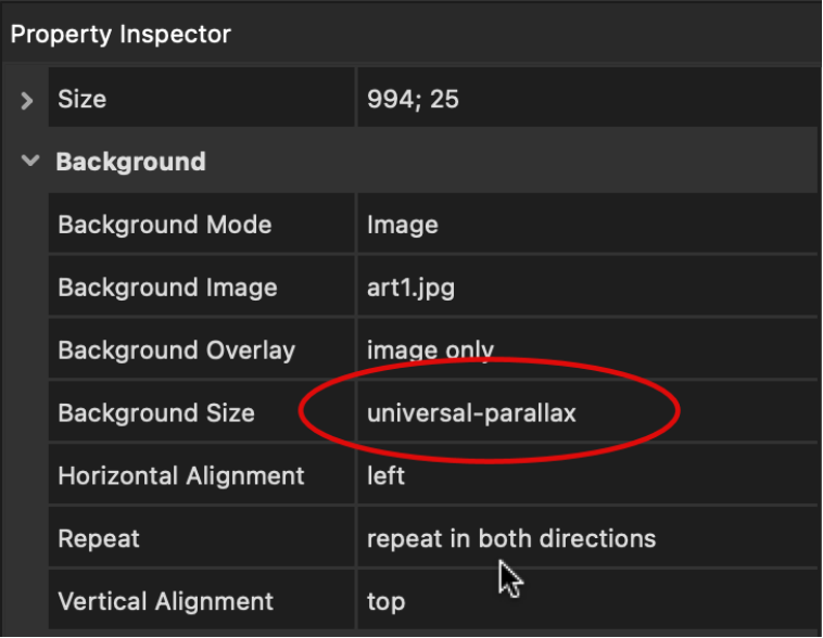
-
New feature: Added support for 'universal-parallax’.
This can be used as alternative for the standard parallax. universal-parallax
is a third-party parallax script that is lightweight and cross browser
compatible. Including mobile platforms (iOS, Android).
https://github.com/marrio-h/universal-parallax
- New feature: Added the ability to select a local file as video background.
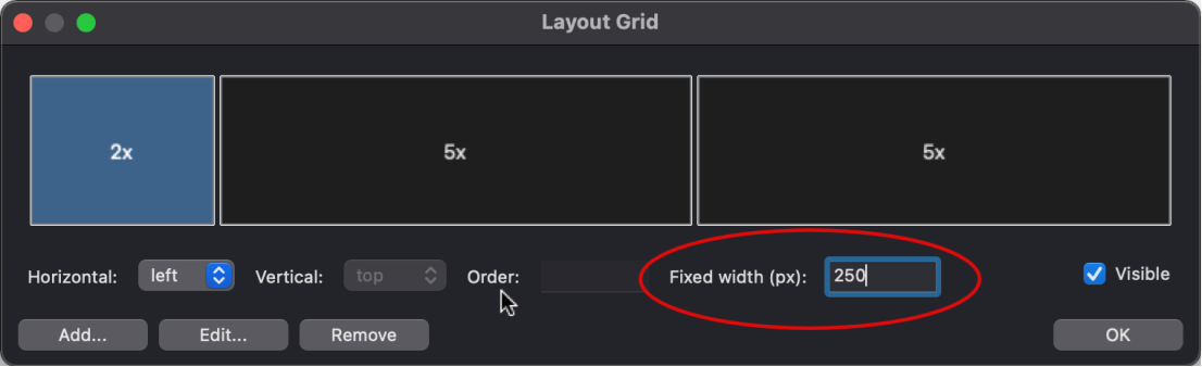
Layout Grid
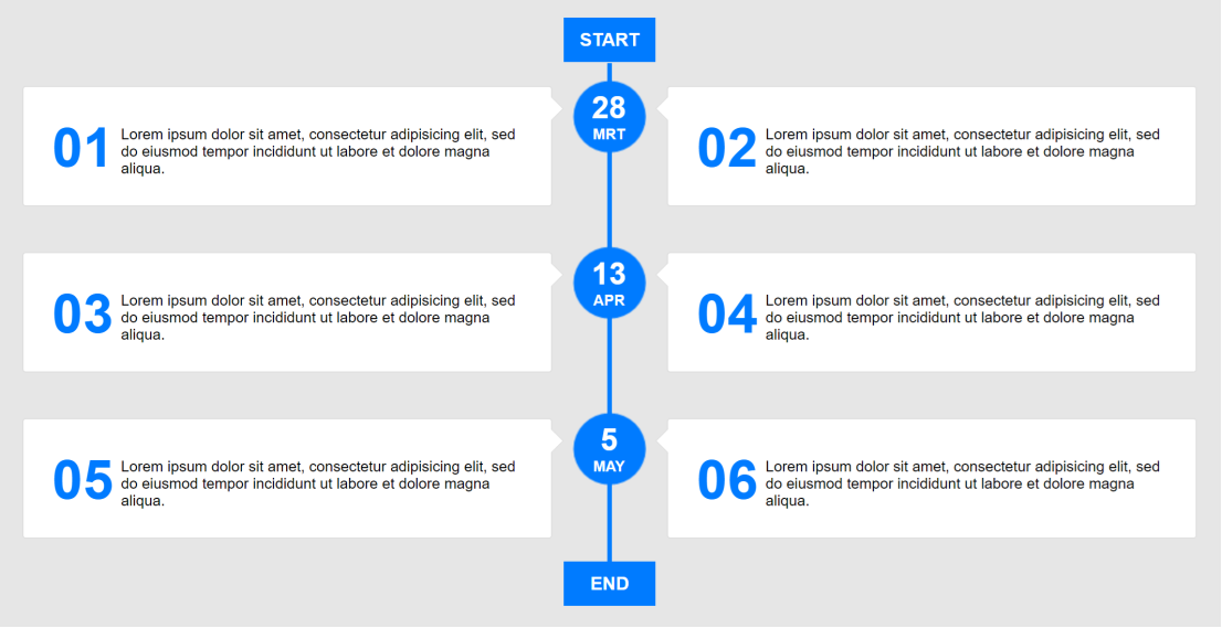
- New feature: Added 'Fixed width' property for columns. This makes it possible to give one or more grid columns a fixed width. This property is responsive so it can be different in breakpoints.
Demo:
https://www.quickandeasywebbuilder.com/support/qwb9tryouts/qwb9_fixedcolumns.html
This feature is also used in the “Timeline with cards“ demo, where the column with cards are flexible and the timeline column is fixed:
https://www.quickandeasywebbuilder.com/support/qwb9tryouts/qwb9_timeline1.html
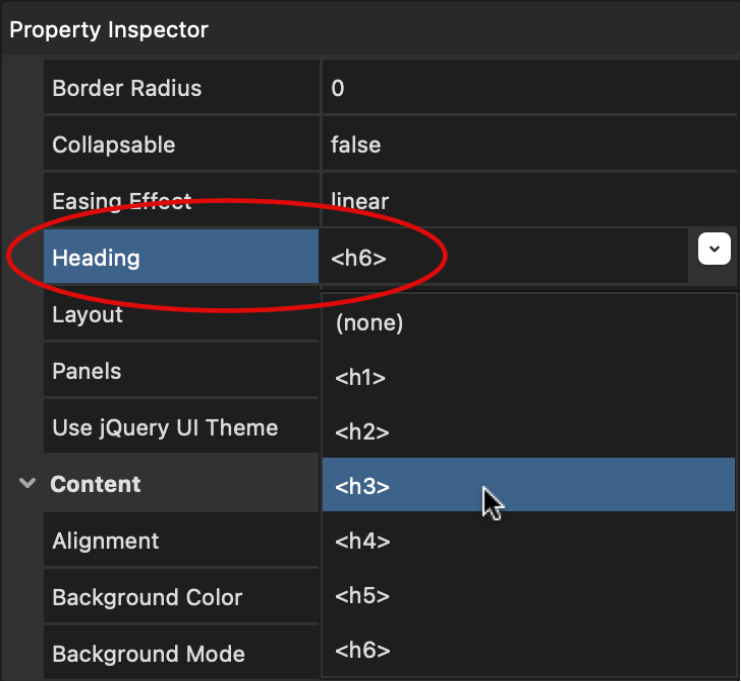
Accordion
- New feature: Added the ability to set the heading tag for the panel titles.
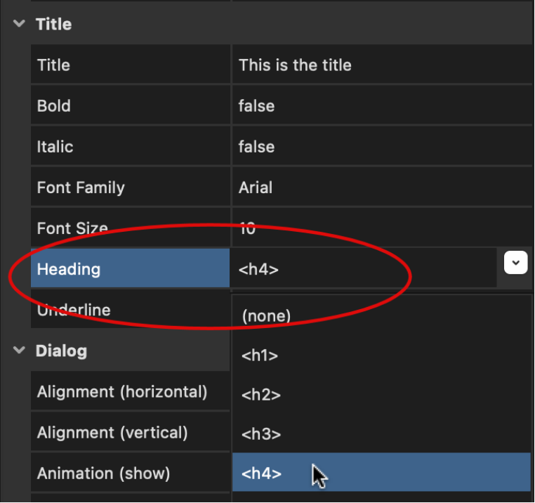
Dialog
- New feature: Added the ability to set the heading tag for the dialog title (applied to Bootstrap only). Previously the title was fixed to <h4>, but now you can control this yourself. This may be useful to optimize your wes site’s heading and /or improve Lightspeed scores.
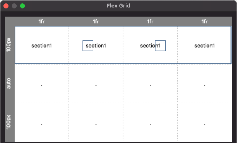
Flex Grid
-
New feature: Added an easier way to define grid areas
using the mouse.
Step 1: clear the grid (via template).
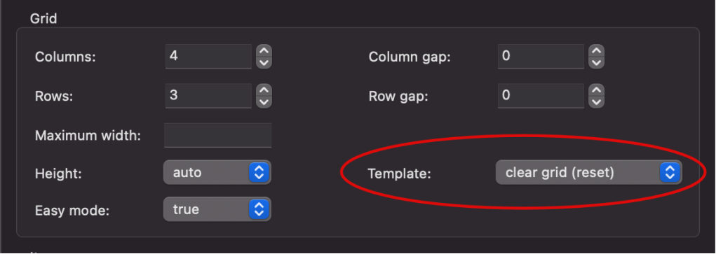
Step 2: click the first cell of the range and hold down the mouse button.
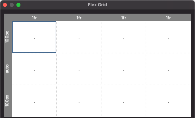
Step 3: move the mouse cursor to the last cell and release the mouse button. A
new range will be created automatically. Repeat these steps to add more areas.
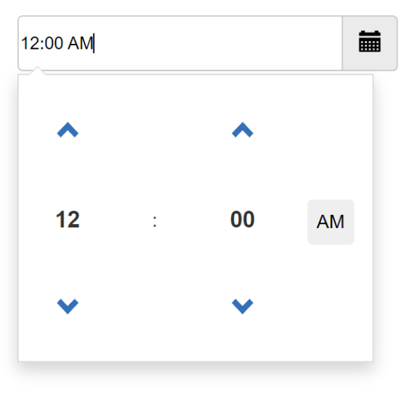
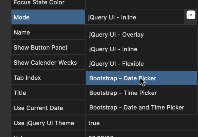
Date Picker
- New feature: Added support for 'Bootstrap Datepicker': date, time or date & time. This can be used as alternative for the jQuery UI date picker. Bootstrap DatePicker is based on Tempus Dominus’s Bootstrap Datetime Picker https://github.com/tempusdominus/
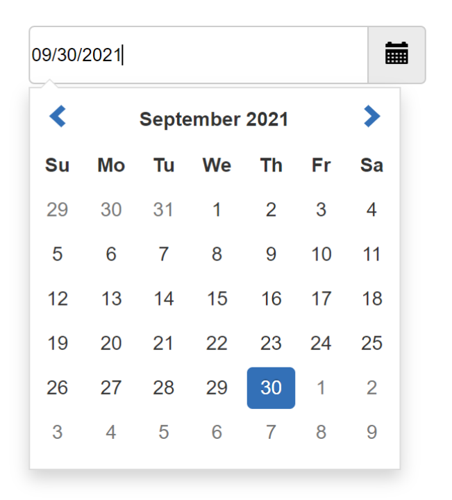
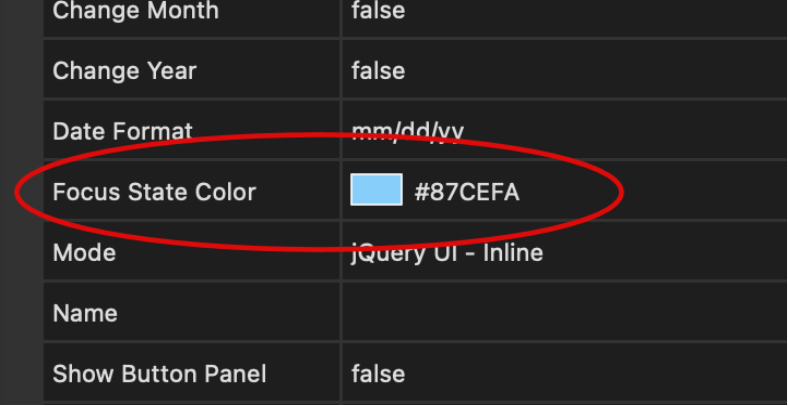
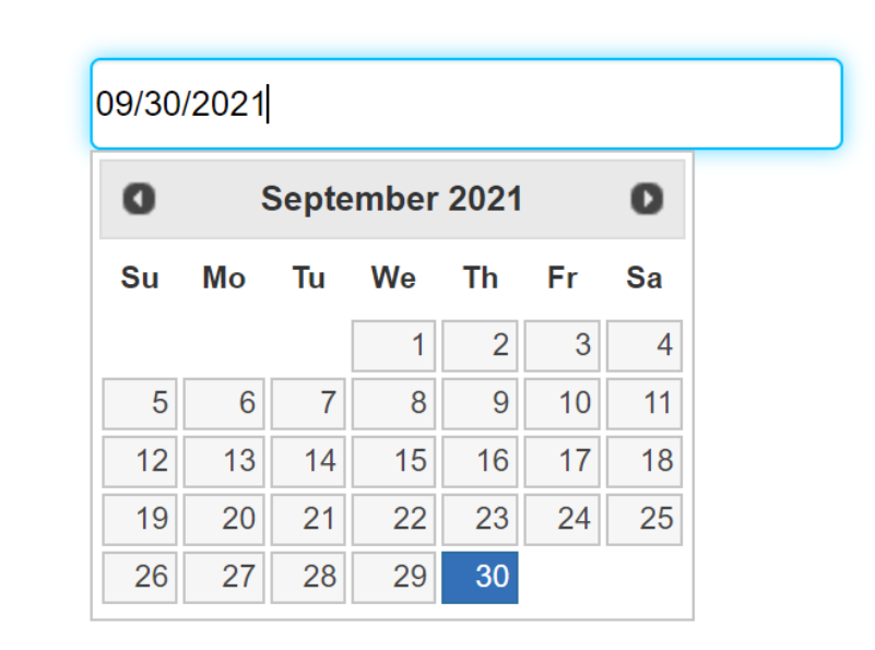
- New feature: Added 'focus color' property (for overlay mode). Specifies the outline color for focus state.
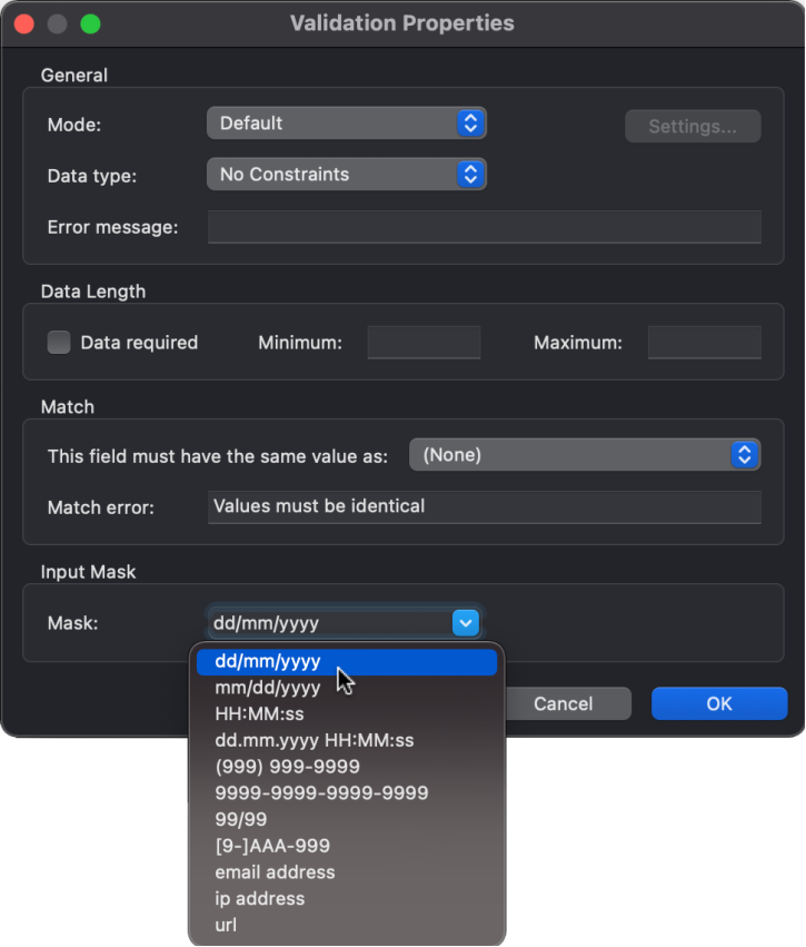
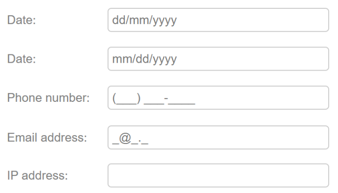
Input Mask
- New feature: Added 'Input Mask' functionality to Editbox. An inputmask helps the user with the input by ensuring a predefined format. This can be useful for dates, numerics, phone numbers etc. The drop-down includes several predefined masks.
What’s the difference of input masks and validation rules?
input masks are about formatting; validation rules are about correctness of values
Demo:
https://www.quickandeasywebbuilder.com/support/qwb9tryouts/qwb9_inputmask.html
Online tutorial:
https://www.quickandeasywebbuilder.com/inputmask.html
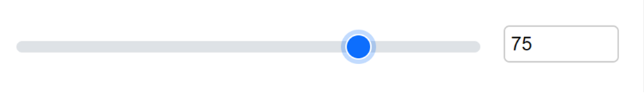
Range
- New feature: Added 'Range' object for use in forms. Implements a slider-like control for entering numbers. You can set a min and max value and steps to define the number intervals. For example: 0.5
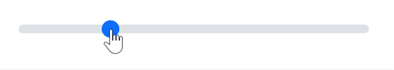
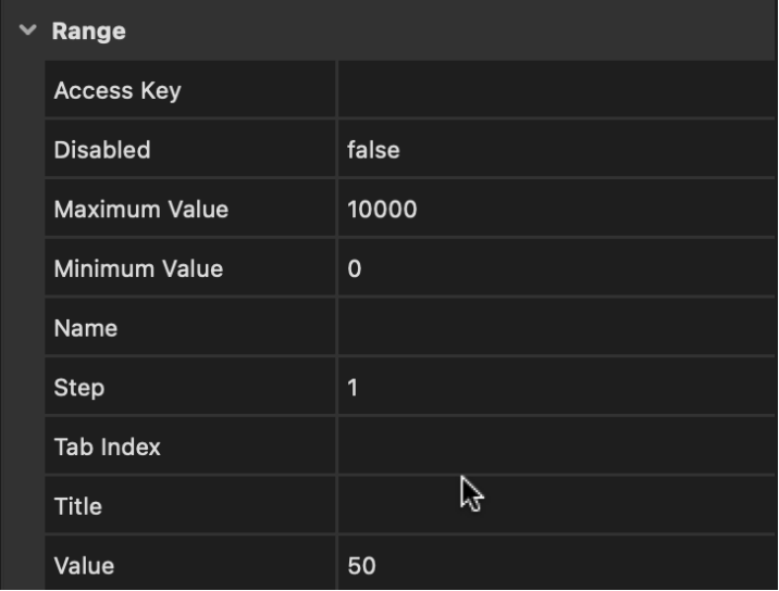
The Range object also supports events and conditions! With conditions, the range can be linked with another input field, for example an editbox to display the selected value.
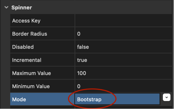
Spinner
- New feature: Added Bootstrap-mode to spinner, in addition to jQuery UI mode. In Bootstrap mode, up and down buttons are displayed at the left and right side of the input field.
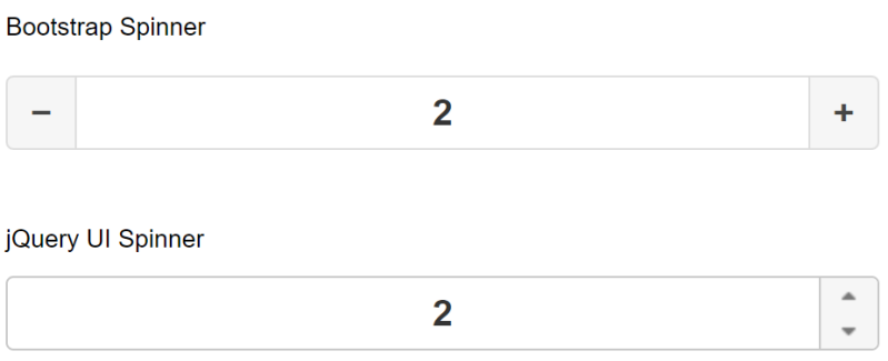
- New feature: Added support for padding. This controls the left and right offset of the text and also affects the size of the spin buttons in Bootstrap mode.
- New feature: Added text alignment property: left, center, right.
- New feature: Added support for conditions. This can be useful to calculate values in a form. For example, calculate the price based on the quantity in a PayPal shopping cart.
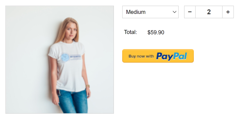
Demo:
https://www.quickandeasywebbuilder.com/support/qwb9tryouts/qwb9_spinner.html
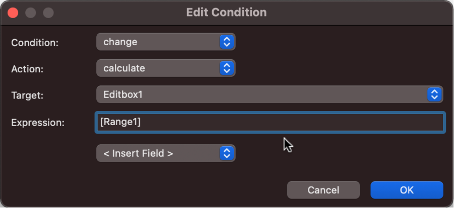
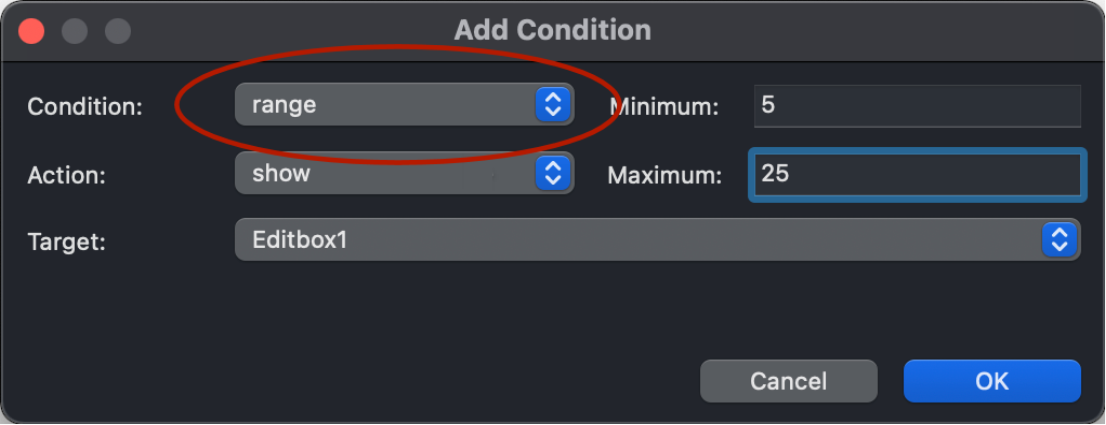
Conditions
- New feature: Added 'range' condition. And easier way to test whether the numeric input is within a range (min / max).
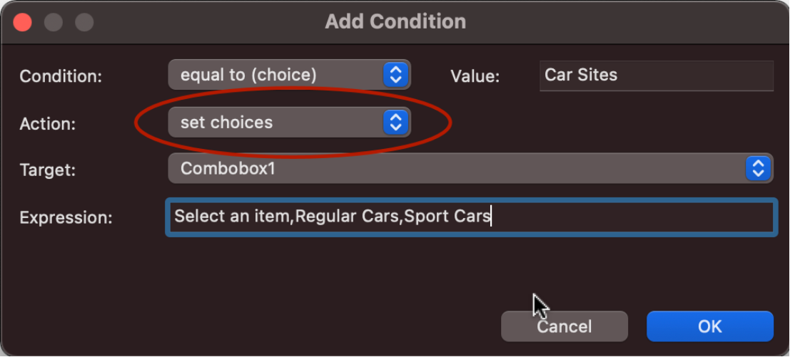
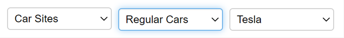
- New feature: Added 'set choices' action. This lets you "chain" multiple form combo boxes (select lists) together so that the selection in a "parent" list can tailor the options available in a "child" list. Options should be separated by a comma: option1,option2,option3. By default, the text is also used as the value. But you can also configure a separate value: option1=1,option2=2,option3=3
Demo:
https://www.quickandeasywebbuilder.com/support/qwb9tryouts/qwb9_cascadingdropdown.html
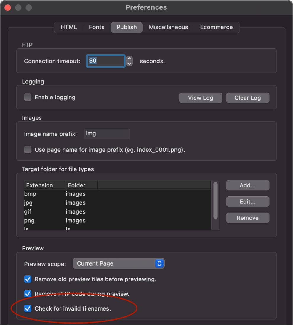
Publish
- New feature: added 'check for invalid filenames' during publish. A warning will be added to the publish log when a non-web-safe filename is detected: invalid characters are: space, #, %, <, >, &, {, }, [, ], ?, $, :, ", ', @, +, =, | and !.
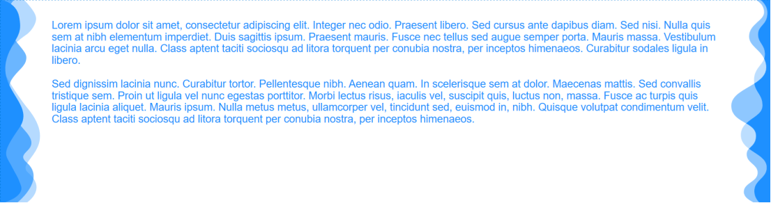
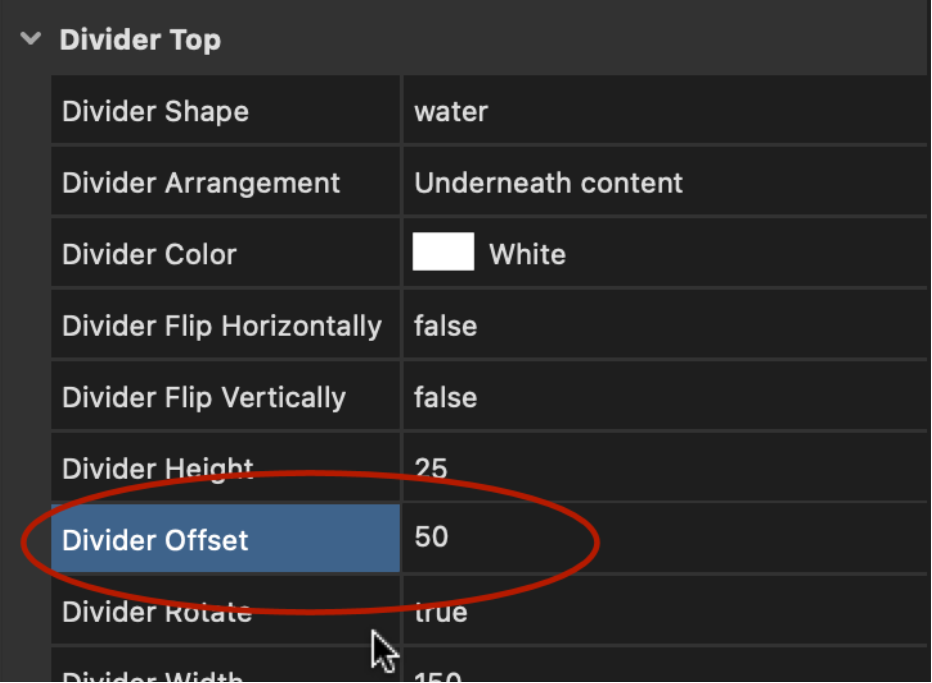
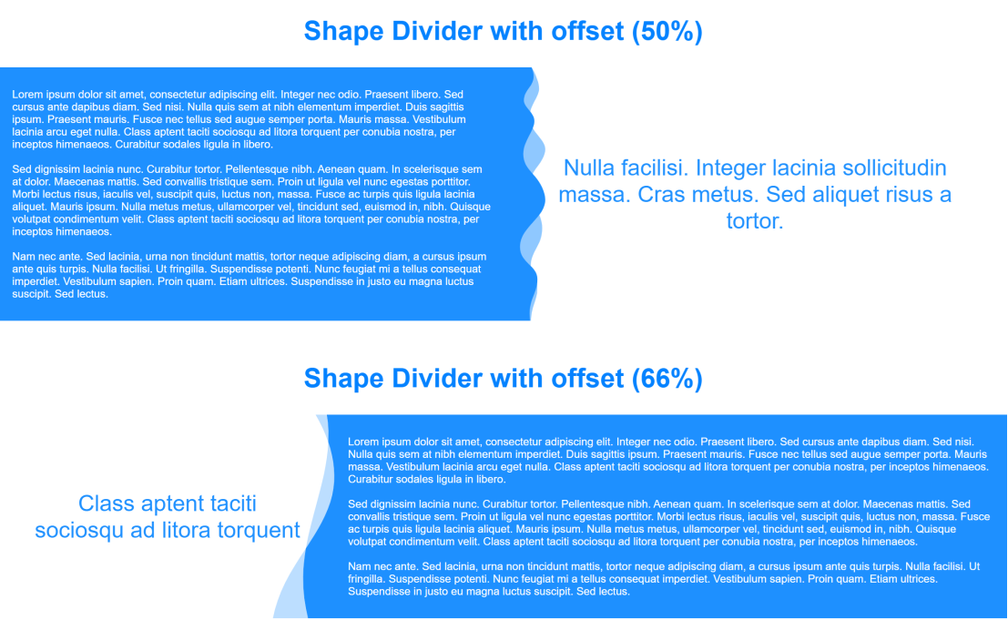
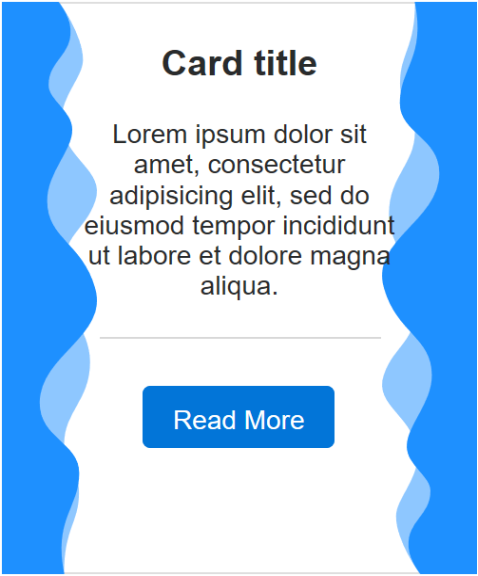
Shape Dividers
- New feature: Added support for vertical shape dividers. This makes it possible to add divider to the left or right side of a layer, layout grid etc.
Demo:
https://www.quickandeasywebbuilder.com/support/qwb9tryouts/qwb9_verticaldividers.html
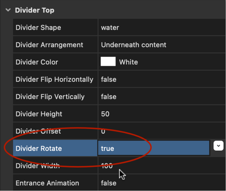
- New feature: Added 'offset' option. Useful for moving the divider to the center (50%) of the container.
Google Fonts
- New feature: Added 96 new Google Fonts.
Icons
- New feature: Added support for Bootstrap Icons (https://icons.getbootstrap.com/) with over 1300 icons. Bootstrap Icons are available as free add-on: https://www.quickandeasywebbuilder.com/iconfonts.html
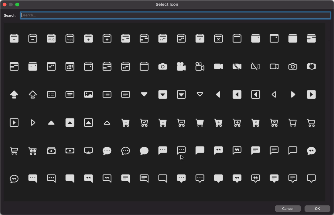
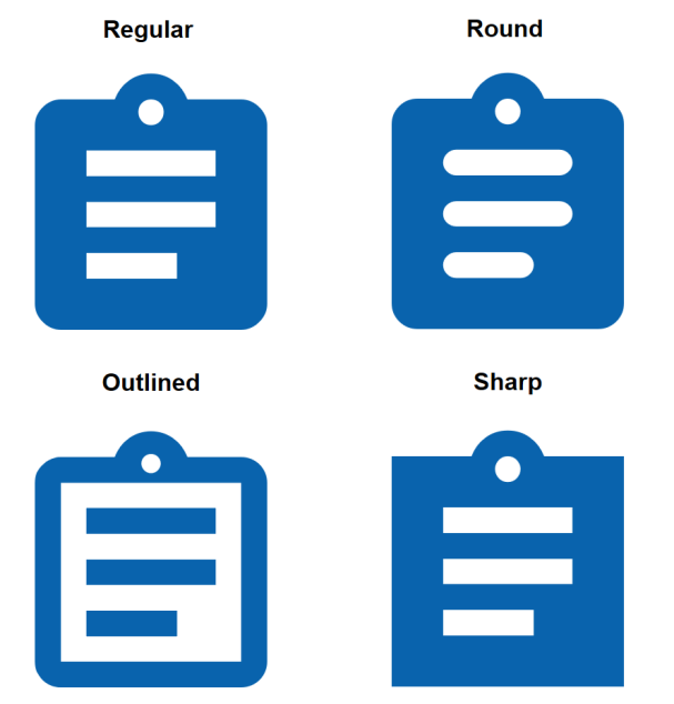
- Improved: Added built-in support for Material Icons 4.0.0 with more than 800 new icons!
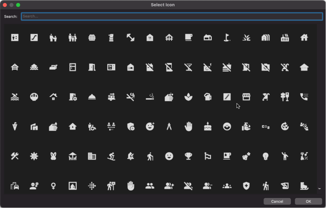
- New feature: Added support for Material Icons Round, Material Outlined and Material Icons Sharp. These are variants of the Material Icons. The add-on Icon libraries are available in the 'Free Extras' section: https://www.quickandeasywebbuilder.com/iconfonts.html
- Improved: Optimized SVG output on MacOS.
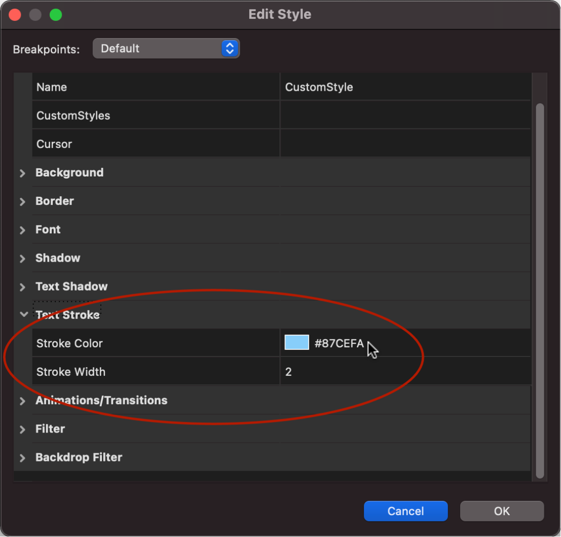
Style Manager
- New feature: Added 'text-stroke' properties. This make it possible to use text-stroke for basically any object that supports styles (like standard text and form elements).
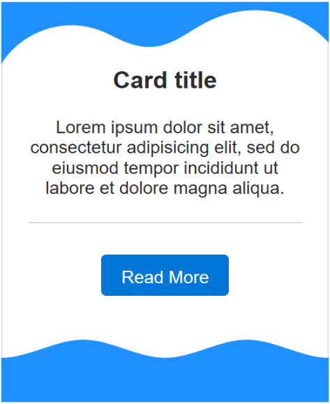
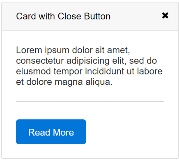
Cards
- New feature: Added support for shape dividers. Another great way to decorate your cards!
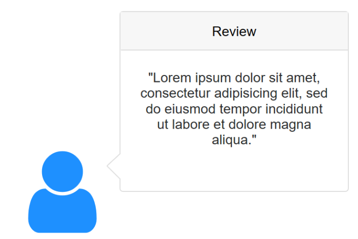
- New feature: Added the ability to add a speech bubble-like arrow to cards. Popover -> trigger -> speech bubble. The size of the arrow can be controlled via the 'font-size' property. Note: in this mode the card will be visible all the time. This feature can be useful to create speech bubble or advanced timelines.
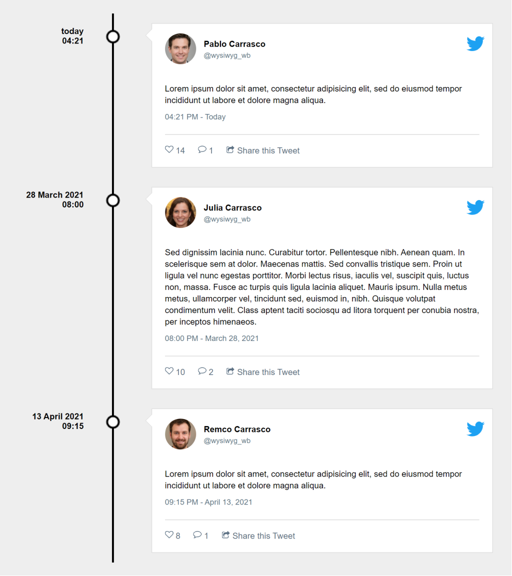
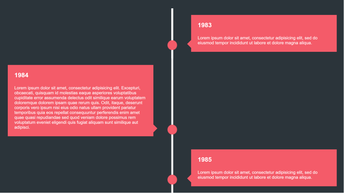
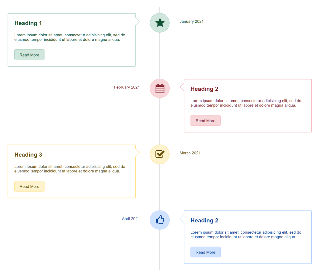
Demo:
https://www.quickandeasywebbuilder.com/support/qwb9tryouts/qwb9_timeline1.html
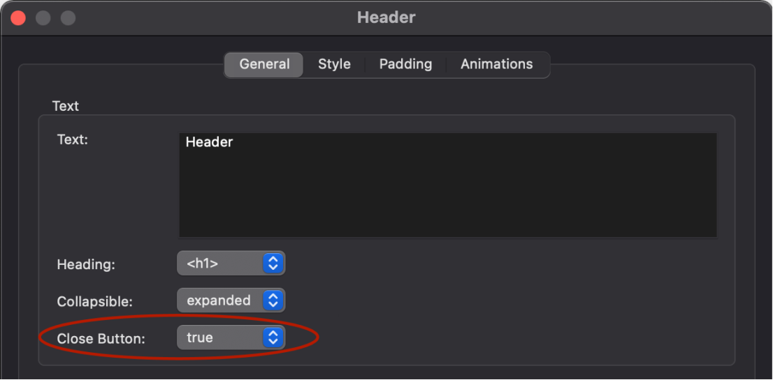
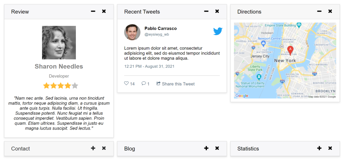
- New feature: Added 'Show close button' option to header item. With close button the user can hide the card. For example, when the card is used in 'portlets' mode of the card container.
- New feature: Added the ability to set text decoration: none, underline or line-through.
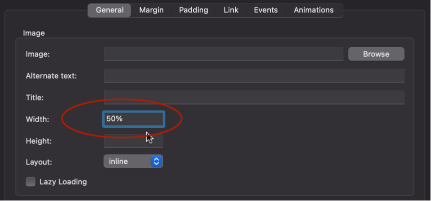
- Improved: The width of image card items can now also be specified in percentages. This makes the size of the image relative to the size of the card, which may be useful for responsive layouts.
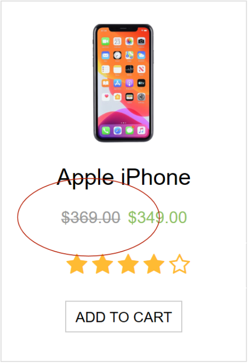
Tip: Cards are also very useful in combination with the new Ecommerce integration.
Demo:
https://www.quickandeasywebbuilder.com/support/qwb9tryouts/qwb9_ecommercecards.html
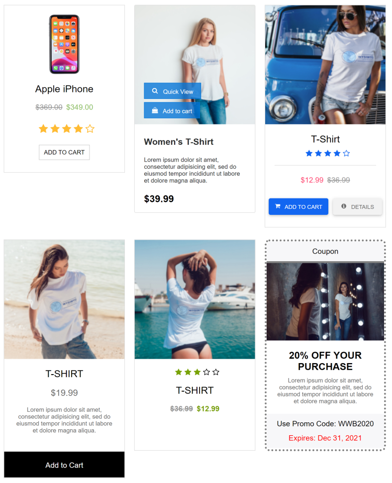
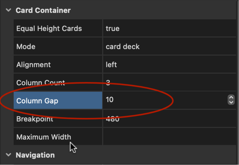
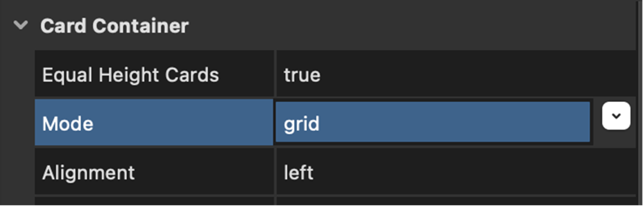
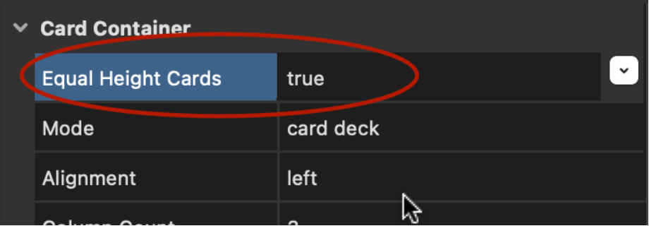
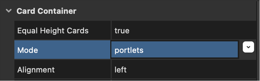
Card Container
- New feature: Added the ability to set the column gap for card decks. This sets the margin for all cards in the container to the specified value. To manually control the margin for each card, set this value to '0'
- New feature: Added 'grid' mode. Allow you to easily create a grid (columns / rows) with card
- New feature: Added 'equal height cards' option. This specifies whether all cards in the same row should have the same height. If this option is off then cards with different content may have different heights.
- New feature: Added 'portlets' mode. In portlets mode, the visitor of the website can rearrange cards via drag & drop. Also, cards can be hidden or expanded/collapsed. The state of the portlets will be saved for the next time the user visits the website (via webstorage). The colors of the drag & drop 'place holder' are configurable. The built-in function resetPortletsState() can be used to reset the state of the portlets (via events).
Demo:
https://www.quickandeasywebbuilder.com/support/qwb9tryouts/qwb9_portlets.html
Animation and Transitions
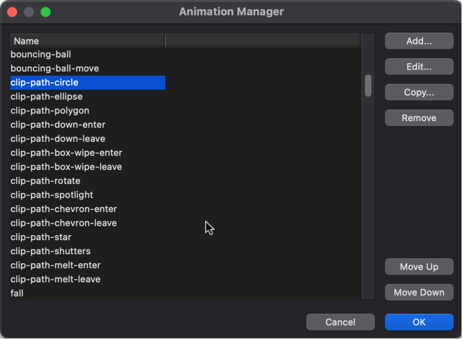
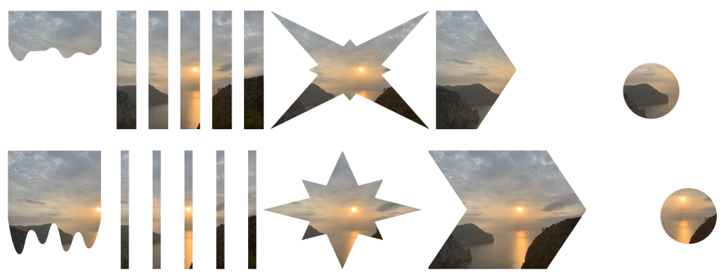
- New feature: Added support for 'clip-path' property. This is a powerful property that allows you to create shape-based animations.
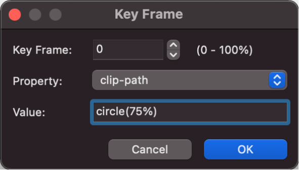
- New feature: Added 15 new animations using the clip-path property.
Demo: https://www.quickandeasywebbuilder.com/support/qwb9tryouts/qwb9_clippath.html
Easing
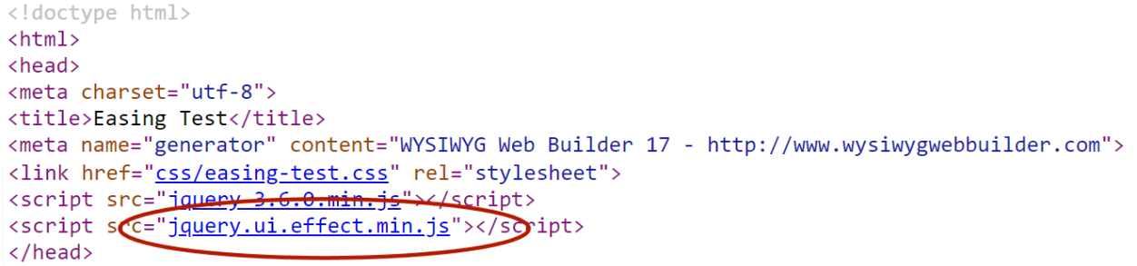
- Improved: When using Easing effects in animations (for example in Bookmarks, Panel Menu, SVG animations, Snap Scroll etc), the HTML generator will now only include the jQuery Effects module (11KB) instead of the full jQuery UI library (248KB)!
ClipArt / Shape
- New feature: Added the ability to use a video as the background for shapes, clipart and textart! This uses CSS's clip-path (https://caniuse.com/css-clip-path) to clip the video inside the path. Supported video's include YouTube, Vimeo, Pixabay and HTML5 video (mp4, webm).
Demo:
https://www.quickandeasywebbuilder.com/support/qwb9tryouts/qwb9_shapevideo.html
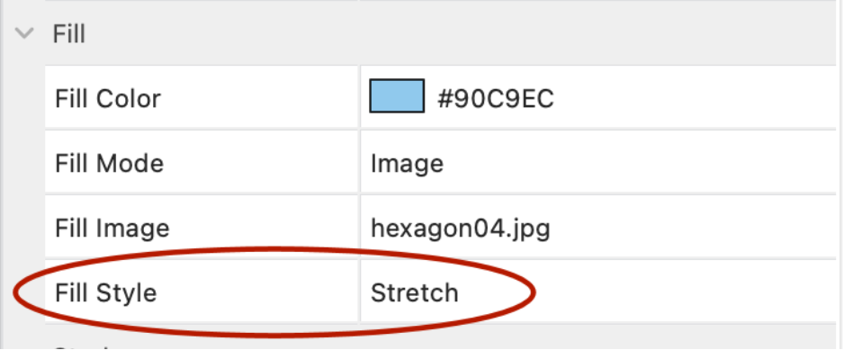
- New feature: Added the ‘Fill Style’ property for image fill mode. The fill style can be either ‘tiled’ or ‘stretched’.
- Improved: Shadow now uses native CSS filters instead of simulated effect (for SVG output). This improves the size, quality and performance of the shape.
- Improved: ClipArt and Shape objects are now responsive when the output format is set to SVG! So, finally shapes can have different sizes in breakpoints even in fixed/absolute layouts.
- Improved: Optimized SVG output for Shapes and ClipArt on MacOS.
Image
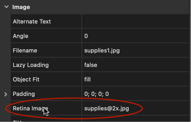
- Improved: Image now uses scrset instead of javascript for the retina image.
- Improved: Lazy load script has been replaced with native HTML
loading="lazy" attribute for better performance. Also applies to
photo gallery and rollover images.
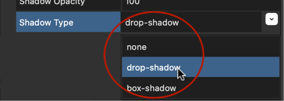
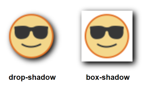
- Improved: 'gaussian blur' shadow effect has been renamed to 'drop shadow' because this is the official CSS name for this effect.
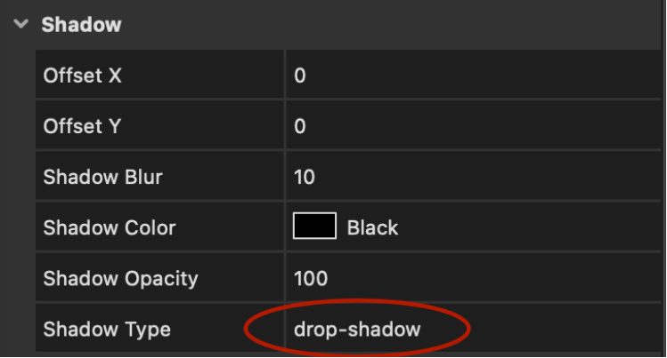
- Improved: 'drop shadow' now uses native CSS filters instead of simulated effect. This improves the size, quality and performance of the image. Also, image remains responsive and the effect is animatable (via transition and animations).
Picture
- New feature: Added support for 'drop shadow'.
YouTube / Vimeo / HTML5 Video
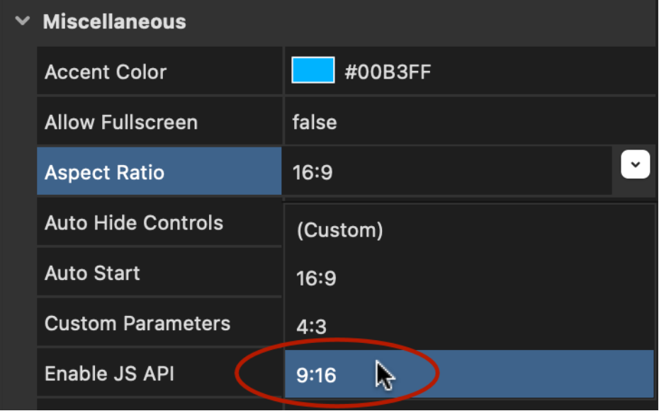
- New feature: Added support for Portrait aspect ratio 9:16.
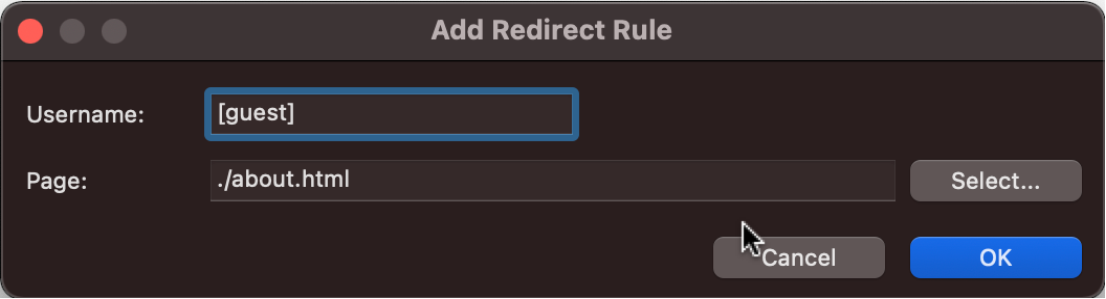
Login Tools - User Redirect
- New feature: Added the ability to redirect with user roles. Use brackets, to indicate that you want to use a user role. For example: {guest] or [admin]
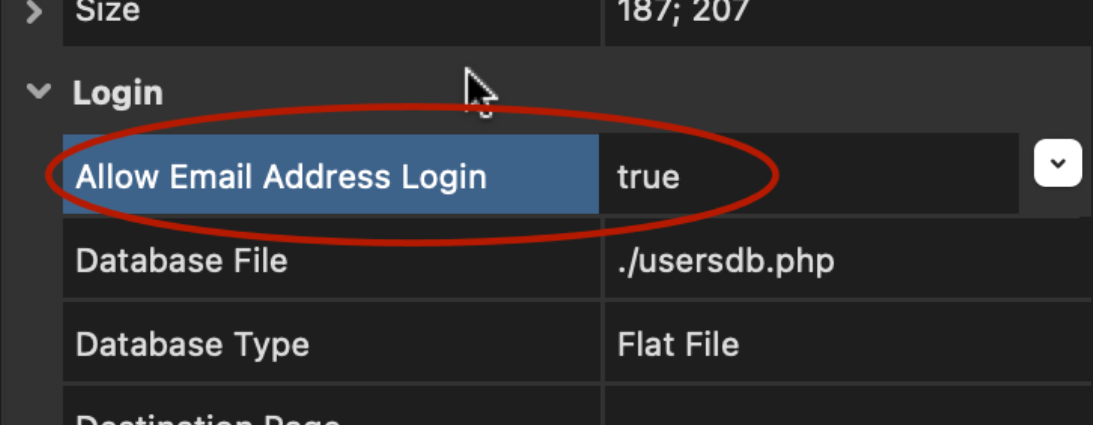
Login Tools - Login
- New feature: Added 'Allow Login with Email Address' option. Specifies whether the user can also login with the email address (in addition to the username).
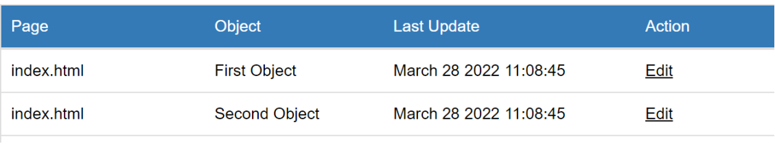
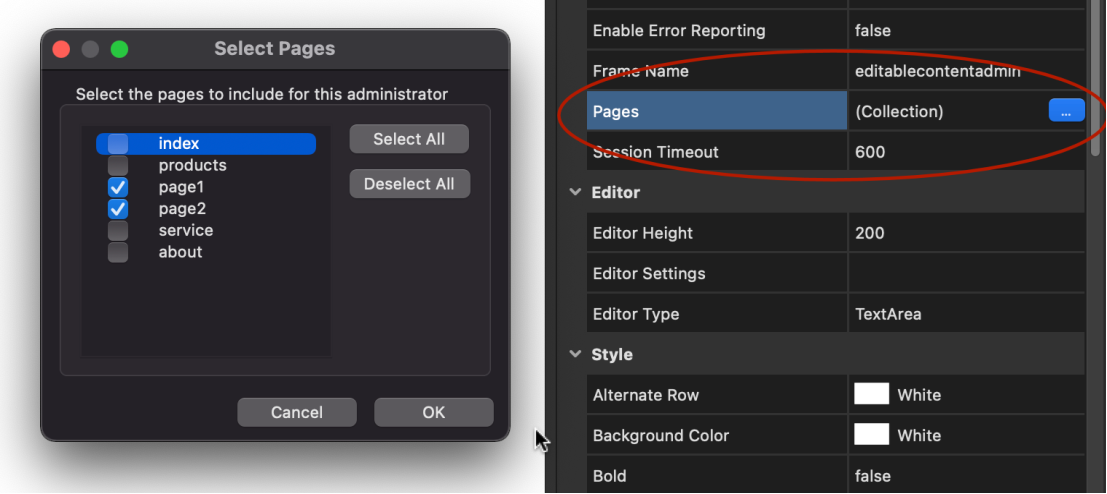
Editable Content
- New feature: Added 'Last modified date' in Admin overview. To remove the 'Last Update' column, just leave the 'Last Update' text field empty.
- New feature: Added the ability to use multiple "editable content admin' object per project. Each admin object can have its own password and you can select which pages can be edited by the admin. Note: if you do not select any pages, then all content pages will be included just like the behavior in the previous version.
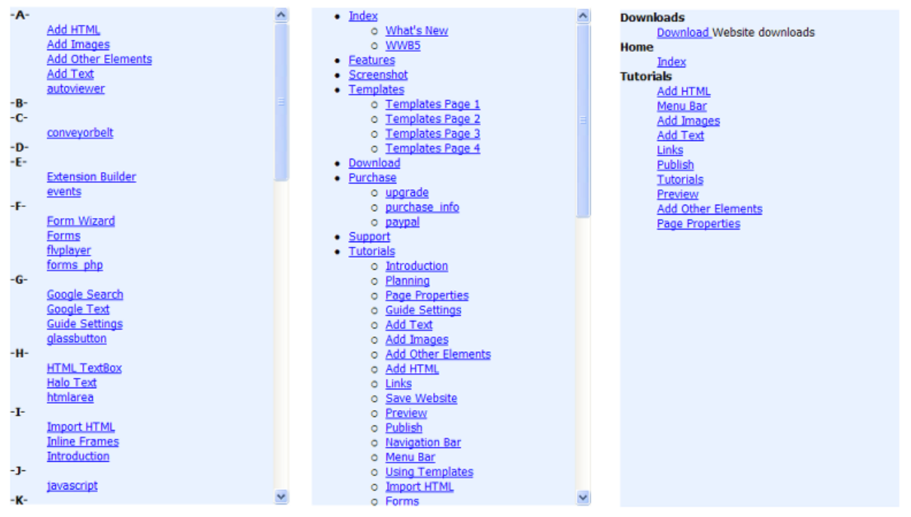
Site Tree
- New feature: Added SiteTree navigation object. The SiteTree can display an overview of your website so visitors can quickly find what they're looking for.
There are 3 display modes, each giving a completely different overview of your site:
Alphabetical
Displays an alphabetical list of all the pages of your website.
Category
Displays all the pages of your website grouped by category.
Treeview
Displays all the pages of your website in a tree view based on the structure of the site in the Site Manager.
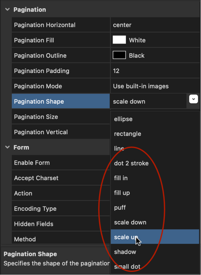
Carousel / Slideshow / Snap Scroll
- New feature: Added 8 new pagination dot styles: Dot 2 Stroke, Fill In, Fill Up, Puff, Scale Down, Scale Up, Shadow, Small Dot
Demo:
https://www.quickandeasywebbuilder.com/support/qwb9tryouts/qwb9_paginationdots.html
- Improved: The built-in pagination dots now use CSS instead of images. This slightly reduces the size and load time of the page.
Links / Navigation
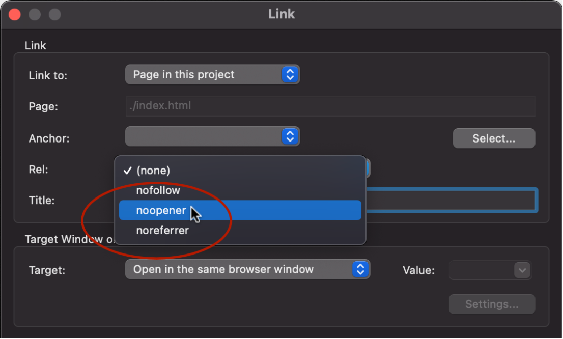
- New feature: Added rel="noopener" and rel="noreferrer" options to links.
This is especially useful when opening untrusted links, in order to ensure they cannot tamper with the originating document via the Window.opener property.
'noopener' instructs the browser to navigate to the target resource without granting the new browsing context access to the document that opened it.
'noreferrer' means that no referrer header will be included. Additionally, has the same effect as noopener. This option may help to improve your Google LightSpeed scores.
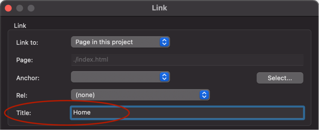
- New feature: Added "Title' property to describe the link. The title is displayed as a tooltip in most browsers — it appears in a small bubble when the cursor hovers over the link.
- New feature: Added the ability to add the "aria-label" attribute to make links more accessible to people with disabilities. There is no dedicated property, but you can specify the aria-label text in the 'Title' property by using the ^ split character.
Example:
Tooltip text^Label for screenreaders
This will result in the following HTML:
<a href="./index.html" title="Tooltip text" aria-label="Label for screen readers">This is a link</a>
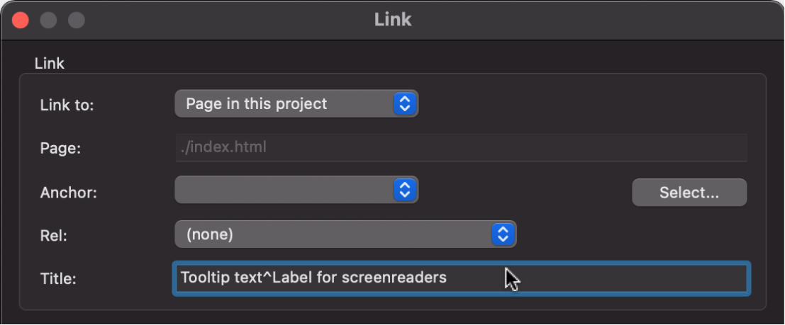
For more information about aria-label is available here: https://www.w3.org/WAI/WCAG21/Techniques/aria/ARIA8.html
Text Menu
- New feature: Added 'Full Width' property. Display the menu full width in Layout Grids.
Breadcrumb
- Improved: Added support for structured data (https://schema.org/BreadcrumbList), so search engines can better understand the structure of the Breadcrumb navigation.

- Improved: The separator padding is now responsive so it can be different in breakpoints. This may be helpful to increase spacing between links on mobile devices.
Quick Menu
- New feature: Added border-radius property.
Themeable Menu
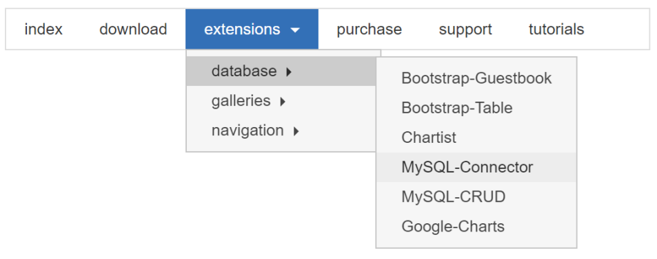
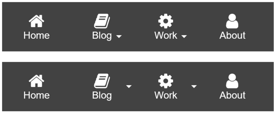
- Improved: Added support for multilevel drop-down menus. Previously only one level was supported. Note: this requires 'click to open'.
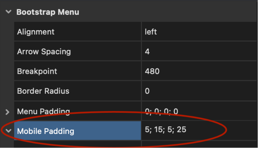
- New feature: Added the ability to set the padding for sub items in mobile mode.
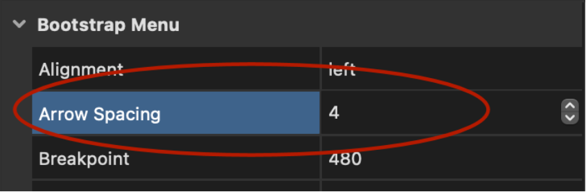
- New feature: Added 'Arrow spacing' option. Specifies the spacing between the text and the drop-down arrow.
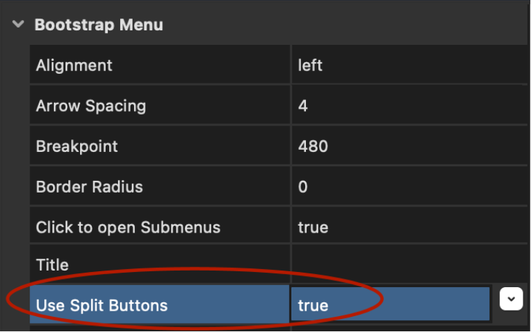
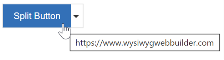
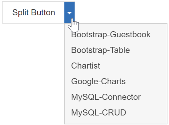
- New feature:
Added 'Use Split Button' option. A split button is a hybrid between a button
and a drop-down menu. It displays a drop-down menu when the user clicks the
arrow, but also offers one-click access to a default choice that doesn't
require opening the menu. Note: split buttons only work with 'click to open
submenus'. Hover is not supported.
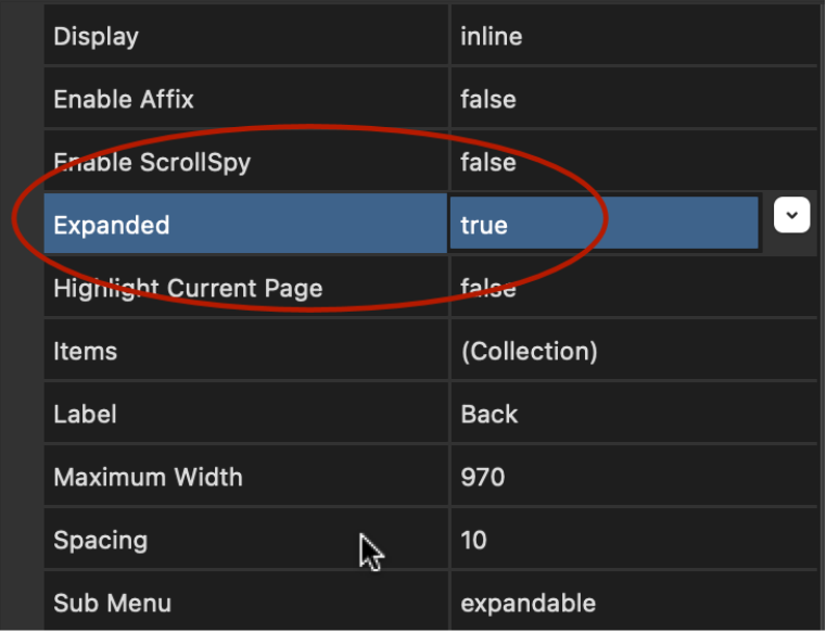
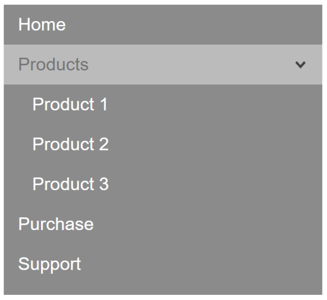
Overlay Menu
- New feature: Added 'Expanded' option. This makes it possible to display the menu fully expanded. For example, to display a tree like navigation. When the menu is full expanded the main items with a sub menu can also have links.
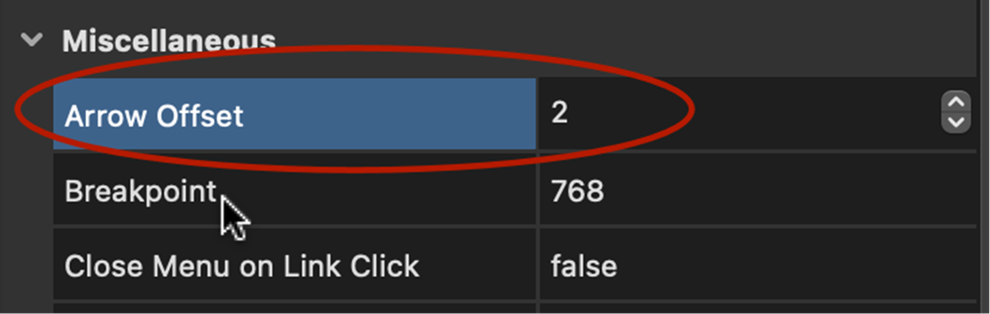
Responsive Menu
- New feature: Added 'Arrow offset' option. This specifies the spacing between the text and arrow (for menu item with sub levels). It is also possible to set a negative offset. In that case the arrow will positioned at the right side of the menu item.
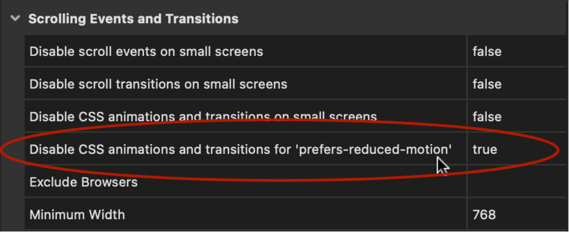
Page Properties
- New feature: Added support for 'prefers-reduced-motion' via "Disable CSS animations and transitions for prefers-reduced-motion". This option will disable CSS animations and transitions if 'Reduce motion' is enabled in the user's system settings. In Windows 10 you can disable animation via Control Panel -> Turn off all unnecessary animations. On the Mac: Accessibility -> Display -> Reduce motion
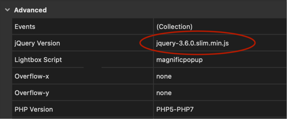
- New feature: Added support for the ‘slim’ version of jQuery.
The 'slim' version excludes the ajax and effects modules and is approximately 17Kb smaller than the full version of jQuery. You can select the slim version if you are just using basic features like simple events (without effects) or Bootstrap based widgets.
jQuery UI widgets require the full version because they use the effects module. Also, Instagram integration uses ajax so this also require the full version. So, make sure test all the functionality of the page to make sure everything works correct with the slim version.
Templates
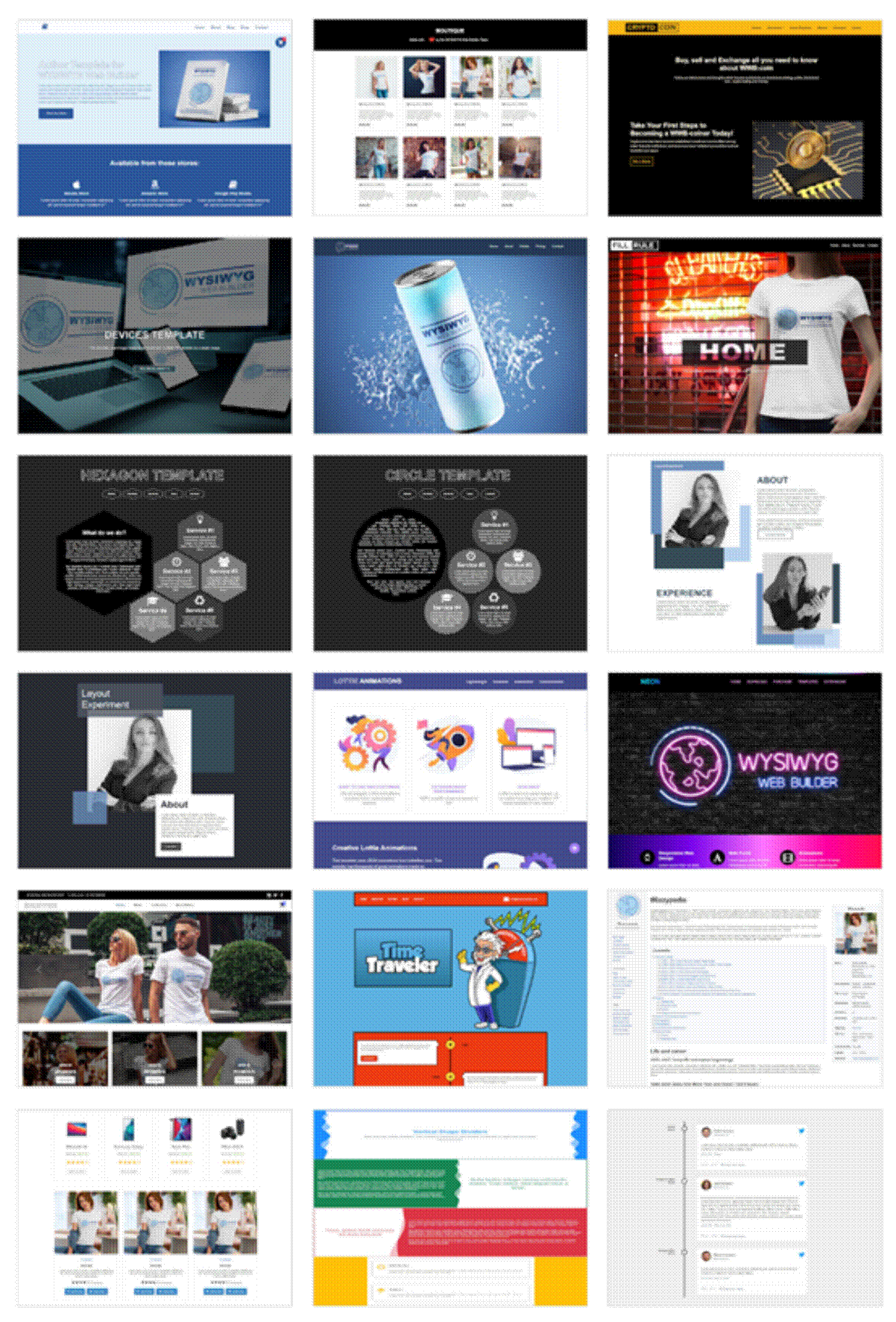
New templates are available to demonstrate some of the new features.
https://www.quickandeasywebbuilder.com/templates2022.html
More Features
If you are upgrading from a version prior to version 8 then also check out what we’ve added in version 2, 3, 4, 5, 6, 7 and 8!
https://www.quickandeasywebbuilder.com/support/qnewb8.html
and
https://www.quickandeasywebbuilder.com/support/qnewb7.html
and
https://www.quickandeasywebbuilder.com/support/qnewb6.html
and
https://www.quickandeasywebbuilder.com/support/qnewb5.html
and
https://www.quickandeasywebbuilder.com/support/qnewb4.html
and
https://www.quickandeasywebbuilder.com/support/qnewb3.html
and
https://www.quickandeasywebbuilder.com/support/qnewb2.html