Form Validation
One of the great features of Quick 'n Easy Web Builder is the powerful form tools. Not only can you easily create forms with the Form Wizard or create them from scratch with the form elements in the toolbox but there are also several form validation options. In this tutorial we will introduce the available validation options.
One of the great features of Quick 'n Easy Web Builder is the powerful form tools. Not only can you easily create forms with the Form Wizard or create them from scratch with the form elements in the toolbox but there are also several form validation options. In this tutorial we will introduce the available validation options.

Note:
Before you read this tutorial make sure you understand the basics of forms:
The following form elements have support for validation:
- checkbox
- combobox
- editbox
- file upload
- radio button
- text area
In this tutorial we focus on the validation of the editbox and more specifically email validation.
More details about the other options can be found in the help. To access the validation tools click the button in the 'Validate' property of the
object's properties.
There are 3 validation modes:
- Default
- Info bubble (real-time)
- HTML5
Default validation
Displays a standard JavaScript message.
Info bubble (real-time) validation
Select this option to enable real-time validation. The input field will be validated as soon as it loses the focus without the need for the user to
press the submit button first. Real-time validation uses info balloons instead of the standard message box, this give your forms a professional
look and feel. To configure the style of the balloons click the 'Settings' button. You can configure the colors, font, bubble type, position and
animation effect.
HTML5 validation
Select this option to use native HTML5 form validation of the browser. Note that this feature is not available in all browsers yet (IE10,
Safari, FireFox, Chrome) and the appearance of the message will also be different.
One of the benefits of this option is that you can apply your own styling to the form field based on the state of the input. For instance you can
give an edit box a different color when the input is invalid.
Here's an example how you can assign different style to different validation states using the built-in styles feature of Quick 'Easy Web Builder:
Step 1
Open the Style Manager and add a new style. Name it 'validation'.
Specify the following values:
- border color: #000000
- border style: Solid
- border width: 1
- background color: #FFFFFF
Click OK to save the style.
Step 2
Select the new style in the Style Manager and click 'Copy'.
Change the name to: validation:invalid
Set the background color to #FF0000
Click OK to save the style.
Step 3
Select the new style in the Style Manager and click 'Copy'.
Change the name to: validation:valid
Set the background color to #00FF00
Click OK to save the style.
Now you have 3 new styles in the Style Manager:
validation
validation:invalid
validation:valid
Step 4
Insert an edit box, open properties and click the Style tab.
Now select 'validation' in Style property:

If the validation type is set to 'Info bubble/real time validation' then the Title property will be used for the info text. You can set the Title property
in the Misc section of the object's properties.

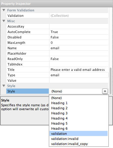
Note: also make sure the Type property of the edit field is set to 'email'!
Step 5
Click the 'Validation' tab of the editbox.
Set mode to HTML5.
Set data type to Email address.
